The Beacon is one of the last entities that don’t have high resolution graphics yet. In the rather recent FFF-339, Albert presented the updated and redesigned Beacon. After your responses we realized some issues we hadn’t seen with the Beacon before, and we have taken some time to think about it...
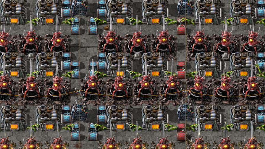
The red tower design by itself is very impressive, which gave it so many plus points that we didn't focus enough on the fact that it is taking too much visual attention. In this case, this happens because of aggressive red colours, the big contrasty yellow eye-like circle, the entity being quite tall, and the electric beam animation. Random variations are usually helpful to make entities look nicer in clumps (like resources), but not in this case, especially as other built entities don’t have any variations.
The options to take from here would be to either update the original design, adjust the red tower, or start a new redesign.
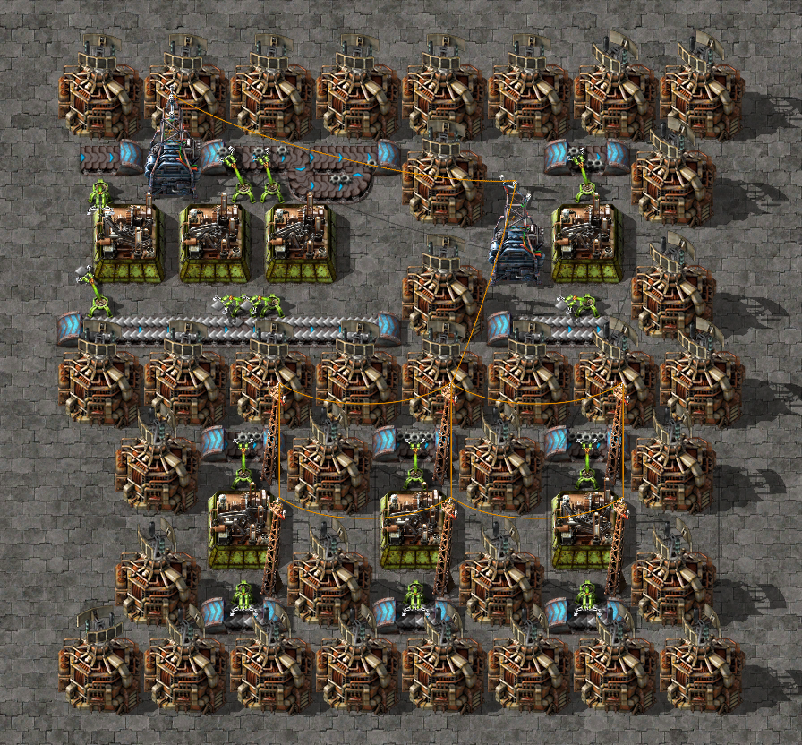
The Beacon is a very special entity, either it doesn’t appear in a factory at all or very little, or it’s everywhere. It doesn’t really do anything by itself so it doesn’t really need to show much activity either.
The original design has its own problems and also saturates the screen very quickly, as they are bright, also tall, and they always move, attracting attention to the movement constantly.
As for the red tower, most of the top part would have to be removed which is almost a complete redesign already, but parts of the hole could be recycled for a new version...
We chose to start a new redesign, with the design goal of the Beacon trying to take much less attention.
For everything we generally respect the idea of height, in the sense that the higher something is, the brighter it usually looks. The less important background is usually darker, while the foreground (entities) is usually brighter, especially at their top parts.
The red tower was put in a hole mostly to be able to create a really tall tower in a 3x3 bounding box yet not overlap the tiles above the entity too much.
What could be done instead is to put the whole Beacon in a hole entirely and therefore make it generally darker and less noticeable. This way we would change its idea from a tower to an underground electronic/powerful entity, and try to explain that the effect is being transmitted underground by cables.
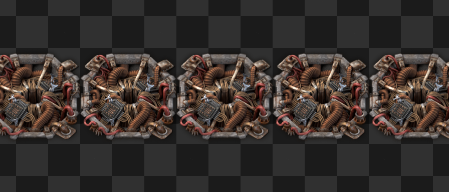
Do notice that a lot of the meshes in the model are coming from Albert’s redesign, which was really helpful to get the new redesign done in a reasonable time.
The beacon is generally less saturated than any of the previous designs, which again makes it less intense, and makes it fit better in its typical habitat of concrete tiles, though it looks just fine on more natural terrain as well.
While the submerged design works well in terms of making the Beacon take very little attention away from the producer entities, there are multiple issues. Most importantly it doesn’t look like a Beacon on the first sight. As a side-effect, the Beacon starts looking very top-down without combating our perspective, though that would probably be possible to address by changing the design significantly.
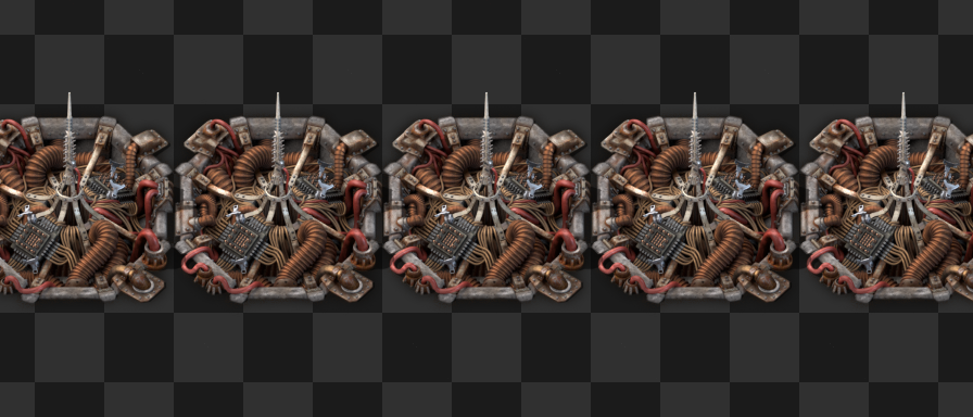
And so a tower clawed its way back into the concept, to explain how the effect is transmitted. Just a slim and lightweight tower though, without taking too much attention.
The two black squares are actually module slots, and the Beacon now dynamically visualizes the modules inside.
This is conceptually questionable, as we definitely don’t want to start a precedent of adding visible module slots to every single entity, but the Beacon has no other use than the modules, so we think it's an acceptable exception.
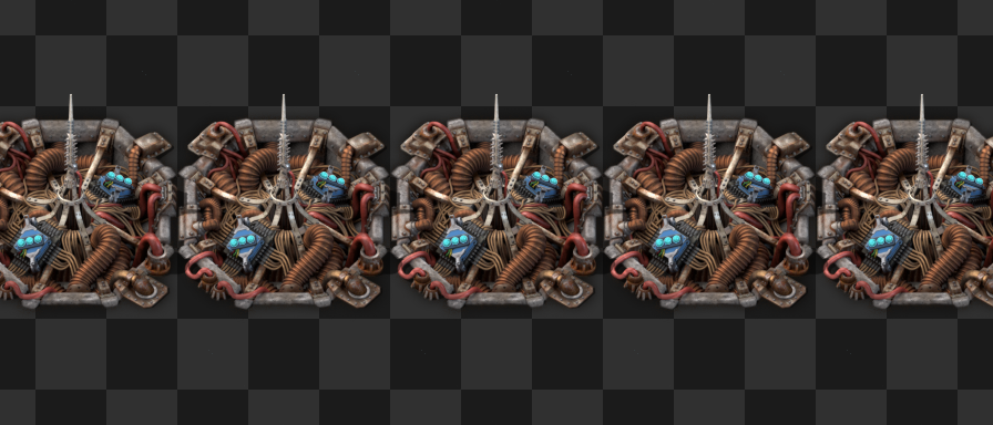
The modules do take a bit more attention back again, but also remove some. With modules always visible, we could remove Alt-mode from the Beacon.
This means whenever you toggle Alt-mode on, you’re only seeing the overlay change on the producer entities.
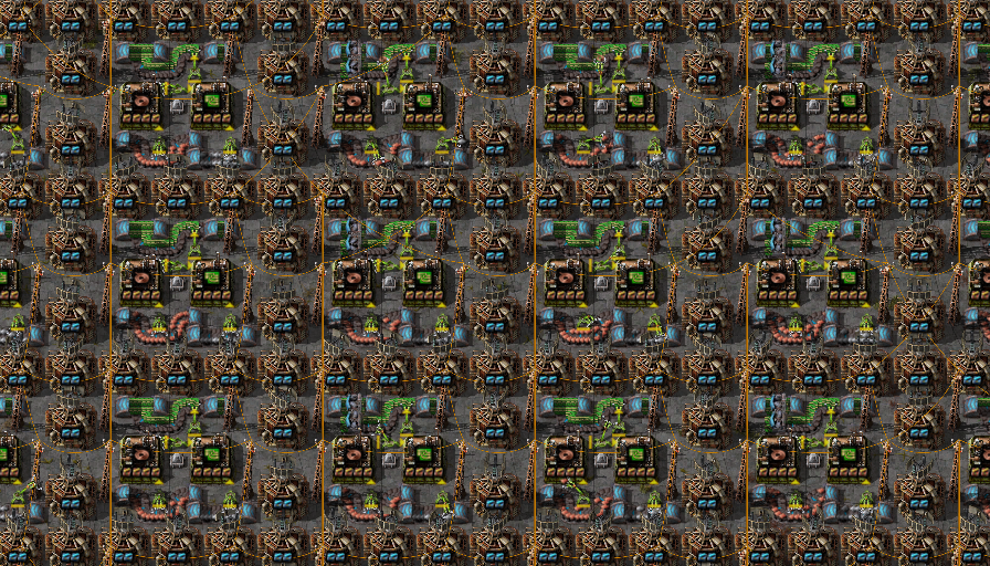
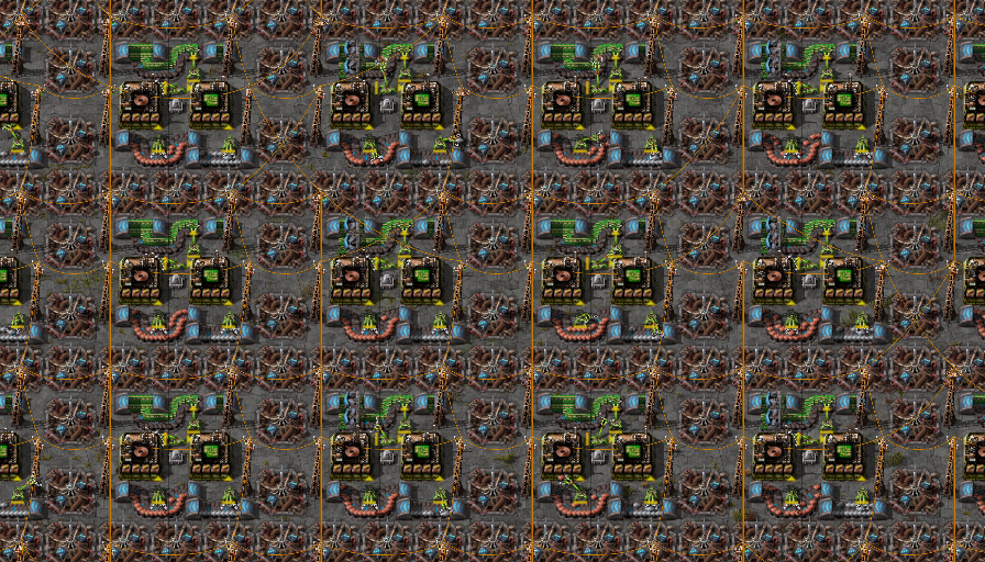
See how much more breathing room do the assembling machines have in the screenshot above. As the Alt-mode overlay isn’t really useful most of the time on Beacons, we can afford to remove this visual clutter. It can of course be re-enabled by mods.
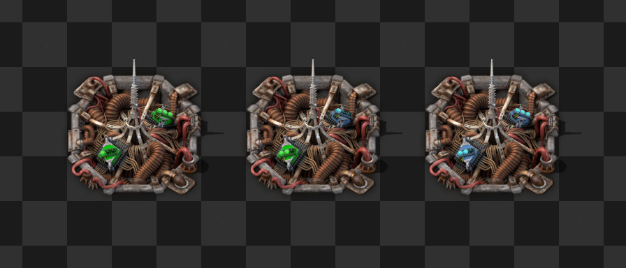
The module slots are procedurally tinted, so if a mod adds custom modules, it only needs to specify the tints at the definition of the module item without touching the Beacon at all.
It’s worth mentioning that one of the reasons why the Beacon got away without high resolution sprites for such a long time, is because it’s a late game entity for generally large factories, so the player mostly looks at them while zoomed out.
As you can see in the animation above, the tower has a subtle glow animation that explains the effect transmission when zoomed in, while almost invisible when zoomed out, trying to balance between being interesting close in, and non-disruptive far out.
The glow effect is also tinted by the colour defined by the module lights, in fact it averages the colour if two different modules are in the Beacon, which isn’t very useful for the base game but for some mods it could be a nice detail.
![]()
As usual, we plan to release the new Beacon next week.
The original concept of fluid mixing prevention sounded great: mixing fluids is (virtually) never desired - so let’s stop it from happening - that's simple. This is the part where the movie stops and the narrator says: "But it wasn't simple, it wasn't even close to simple..." To keep things short I'll just say: complexity compounded with more complexity and an entire game built without the concept of "fluids can't mix" meant over a year and a half later there are still parts that can't be handled "gracefully".
When the concept was first talked about it seemed... off. Mixing fluids is not desired - and the solution is to full-stop prevent it? But let’s take that same solution and try to apply it to something else: belts. Mixing belt contents is (mostly) not desired (people have gone full crazy and made setups around it... but that's another story). So what if the game tried to stop you from mixing belt contents? Sounds crazy to me.
But it happens: belts get mixed and it's not as big of a problem as fluids getting mixed - why is that? Because there's a quick and easy way to fix the problem: just 'hoover up' the items from the belt and its fixed. There's no quick and easy way to fix mixed fluids - you have to pull up the entire length of pipe to get it all out. Even if you don't mix fluids - but just get the wrong one in a pipe - it's still a huge pain to fix.
This idea isn't new - it was talked about back when fluid-mixing-prevention started - but it was recently brought up again and we decided to give it a try: simple fluid mixing prevention. Just try to handle the most common case - manually building things - and in the more complex cases where mixing might happen, provide a quick-and-easy way to fix it: a button to flush all of a given fluid from the pipes.
This new simplified system will be ready for release next week, so you can give it a try and let us know what you think.