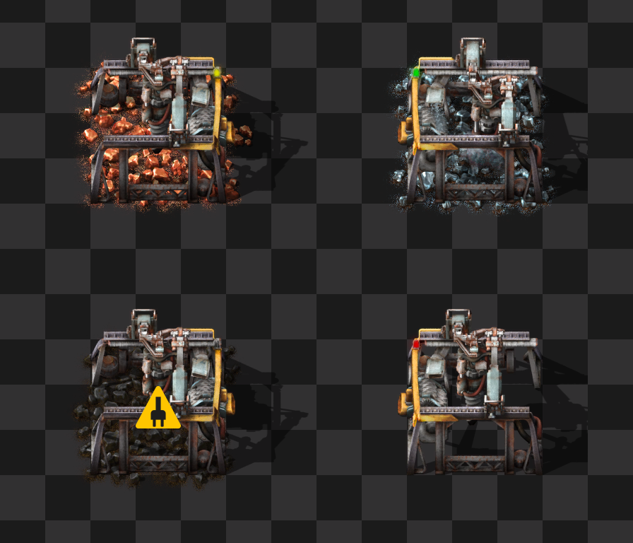
The electric mining drill is one of the older designs still in the game, and we have had our eye on it for a long time as a candidate for redesign.
We would have loved to rework the mining drill in 0.15 when we added high resolution graphics and the pipe patch for it, but we had many nuclear related graphics to do for 0.15, so we just did the necessary minimum and postponed the full redesign. Now was finally the time we could unleash Ernestas onto it.
The most problematic aspect we see is the weak radial animation that’s more like gently harvesting a field, rather than aggressively mining and destroying the planet.

The original mining drill is also very flat like a top-down square. In general we try to avoid square entities like the plague, as they tend to look disintegrated with the world because they don’t try to hide that their perspective isn’t correct.

The pipe patch for uranium ore mining makes the mining drill look like a different entity as it is massive compared to the ultra lightweight drill. Now that we can account for the pipe patch from the start of the design process, we can make it better integrated.
The drill bit is the part that does the action and therefore is the main characteristic for the entity. We spent multiple iterations trying to find the right shape for it first.
We tried a tricone, four metal drills, a cone shaped drill bit, and none of them worked. Mostly the problem was visibility or too many details, which became even worse while drilling. Having a small pixel area is what usually limits us on what we can create, and also things need to be recognizable from far away.

Through trying various options, we chose to use a similar solution to the burner mining drill, as that is already established in the Factorio language. It makes it clear that the miners are one family of entities.

The old animation had one big benefit - it could work non-stop and move around the collision box so it looks like it’s harvesting from various tiles. With the new construction of the drill, it has to lift to move around. However, the drill can be outputting resources even when the drill bit is lifted, so we have added a working LED and a tintable layer for resources being dropped to the output, making it clear when the drill is in a working state.

Since the movement of the drill is procedural and Ernestas was smart about optimizing the spritesheet space, we can save a lot of VRAM compared to the original mining drill (about 40MB). We were considering a lot more additional animations but it would multiply VRAM requirements too much, or it would become too procedural and too complicated to implement.
The resource layer, the pipe contents and the smoke emitted by the drill bit are all tintable layers, specified by resources, which make it very dynamic and mod friendly.

The remnants ignore rotations, but have 4 variations. Typical mining fields usually use only 2 rotations anyway, so this way it always looks a bit nicer.
The sound of the mining drill has also been updated. Unfortunately Factorio does not support multiple working sounds per entity, which also means we can’t synchronize sounds with the animation. So Ian had to invent a sound that would work nonstop. Since there is almost always more than one mining drill working, it should be fine.
We were finishing the mining drill in the last few weeks so we couldn't release it with the new icons. We didn't feel like creating a new icon for the old design and found it to be a cute little hint that the redesign is coming. Hopefully the confusion why the new icon looks completely different to the entity will be cleared up next week when we release the redesign presented in this post.