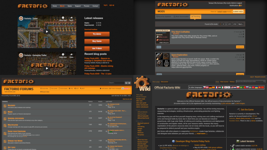
Over the course of the past year, you have seen the team put a lot of effort into polishing the game to get it ready for a full release. There's no doubt this is the most important effort here: we're all here to play the game. At the same time, the website is often the first thing people encounter—and in for many, return to every week! Unfortunately, until this point the looks of our websites have been neglected. The current set of websites are a complete mishmash of styles that are not coherent and do not fit with the look of the game.

Which website am I looking at again?
We set out to rework the looks of our websites last year to make them harmonize with the final game.
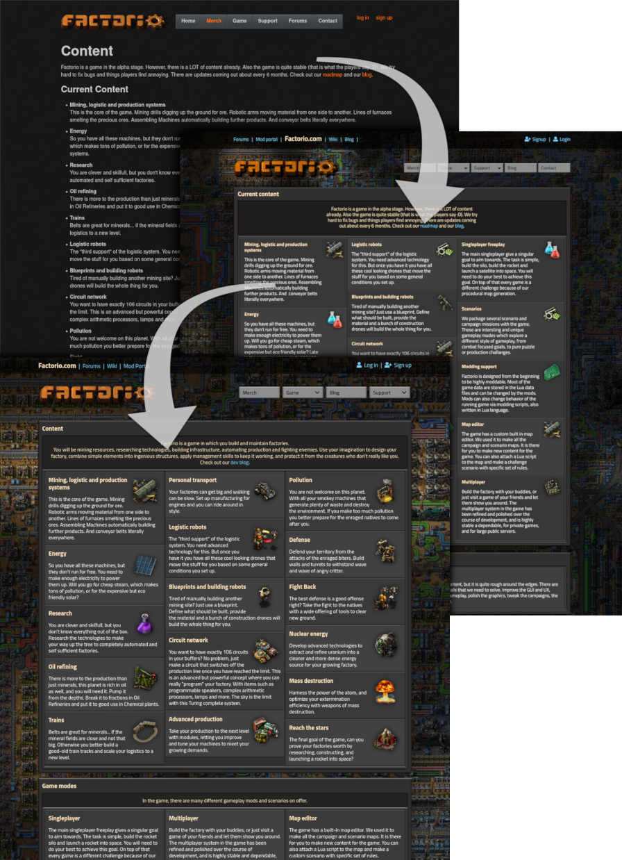
Albert and Aleš worked together to design the new website and make mockups in a process not too dissimilar to the GUI work in the game. Of course, web technology is a different beast from anything the game uses. My task was to take the mockups for each page and implement them as closely as possible (my own creative liberties notwithstanding).

The process from original page to mockup to the new version
My approach to creating websites is conservative, and in a way mirrors the philosophy we use when developing the game. The Factorio website doesn't use a fancy modern JavaScript framework. I'm not a JavaScript hater. There is no harm in using JavaScript to make parts of the website interactive, and of course many web applications wouldn't be possible with it. But for a website like ours, avoiding the use of bloated JavaScript frameworks helps keep everything load and render quickly, and of course the website can be browsed without JavaScript as well.
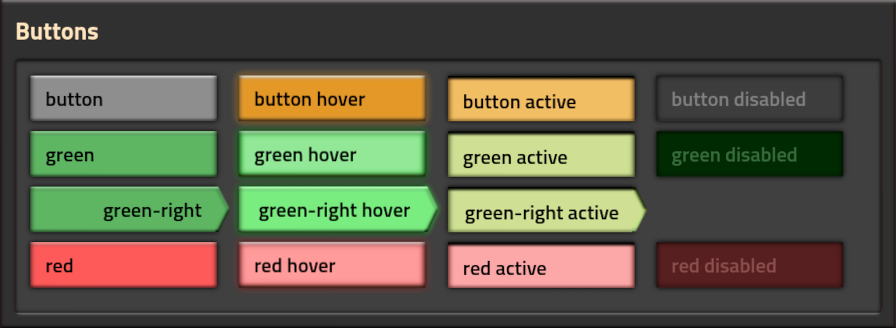
To get the looks right, I set out to create a CSS framework to visually mimic the Factorio GUI style. Where possible, I avoided the use of images. This keeps the page fast and ensures it stays sharp on all resolutions and levels of zoom.
For instance, the buttons match their game counterparts closely, but are made only using shadows.

The only exception is the arrow facing to the right, which simply isn't possible to reproduce using CSS (I tried!). However, even then the performance is kept slick because the graphics for it are embedded in the stylesheet.
The layout for new pages with sleek grids is enabled thanks to modern CSS technologies like Flexbox and CSS grid (no floats, no tables).

At the same time, the mod portal also received the new design.

I also took the effort to unify login sessions between the main website and the mod portal, so you no longer have to log in twice.
This Friday Facts is the last time you're seeing the current (old) style, so enjoy it while it lasts! The new website will go live sometime next week. Once the new design is out, don't forget to click on the rocket!

My part in the website update was going through all the pages and updating the content, with a side goal of reducing overall the number of pages we have, either by merging pages or just deleting pages we no longer value.
Since 1.0 is so close, I decided to just 'pretend' that 1.0 is already out, and update the content to match it. That means there is no mention of early access, ongoing development, roadmaps, alpha releases, etc. This allowed me to clean up quite a lot of the pages, and make them much neater and more clear. This might cause some confusion until 1.0 is actually released, but that's just 2 months away now, so its not a big concern for me.
While going through the Presskit, I found myself wanting to include some of the 'cool' images that we've made over the years that aren't really screenshots. Things like the 2020 Rocket poster, or the Player and the biter giving a toast the new year.
Initially I thought I would just throw them in the Presskit page willy nilly, and that will get them out there. We have some really nice images that are good for things like Youtube thumbnails, Website articles and reviews, etc. so I really wanted them to be accessible at least somewhere. However having them only on the presskit might mean they aren't really discoverable to the average player or new website visitor.
So I decided to add a brand new page, the Artwork page. Initially I just added the nice flashy posters, the 2020 rocket, GDS cover, etc. but I figured there are lots of interesting images we can include from the years of publishing the FFFs. So I went through all the 350+ blog posts, to try to find the best images to put up on the page. I wanted to avoid images that shows old graphics or potentially confusing/outdated information.

It feels like this Artwork page is a great showcase of all the work we've done over the years, and I am really happy with how it turned out. Gathering the best images and compiling them into the single page, it started to seem like we really are reaching the finish line, and we will have some closure on the alpha development. Its been a long journey, and while we have a lot to look forward to with Factorio development, part of me feels a bit sad knowing this chapter of the game is drawing to a close.