I have been tracking the amount of tasks and forum bugs required to finish 1.1 since the 1.0 release. This allowed me to get quantifiable feedback whether we are actually keeping the timeframe of the 1.1 release reasonable, or digging too deep and expanding the scope too much.
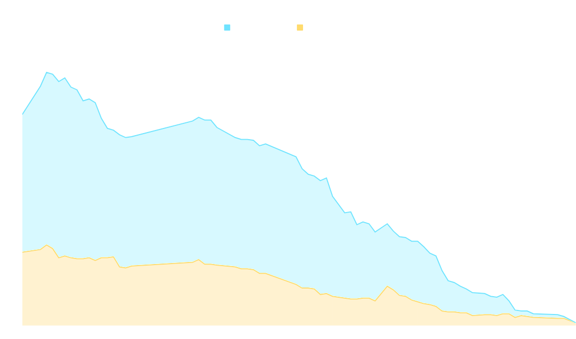
If we extrapolate the graph, the 1.1 experimental should be ready next week.
To celebrate and commemorate the launch of 1.0, we wanted to produce a special limited edition T-shirt. For a few reasons, our supply was not ready in time for the launch in August, but we are ready now.
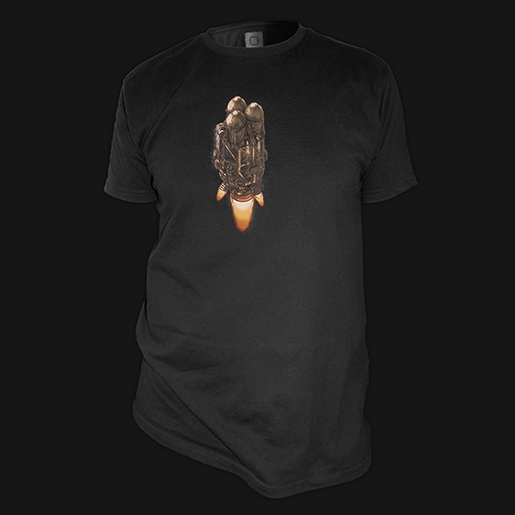
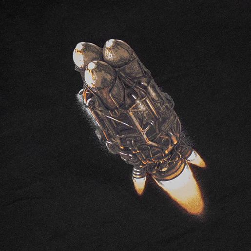
We have also always wanted to have Wube bags, and now we have them! They are really high quality sturdy cotton, we're pretty sure they will last a long time.
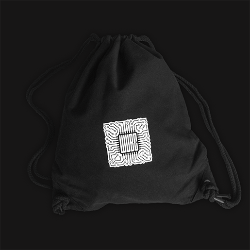
As with previous years, if you want to ensure an order will arrive before Christmas, you really should order as soon as possible on our e-shop.
There are a lot of smaller changes in 1.1, and explaining all of them would make this just an extended changelog, so we will only talk about a few of the more significant topics.
We unified the entity GUIs:
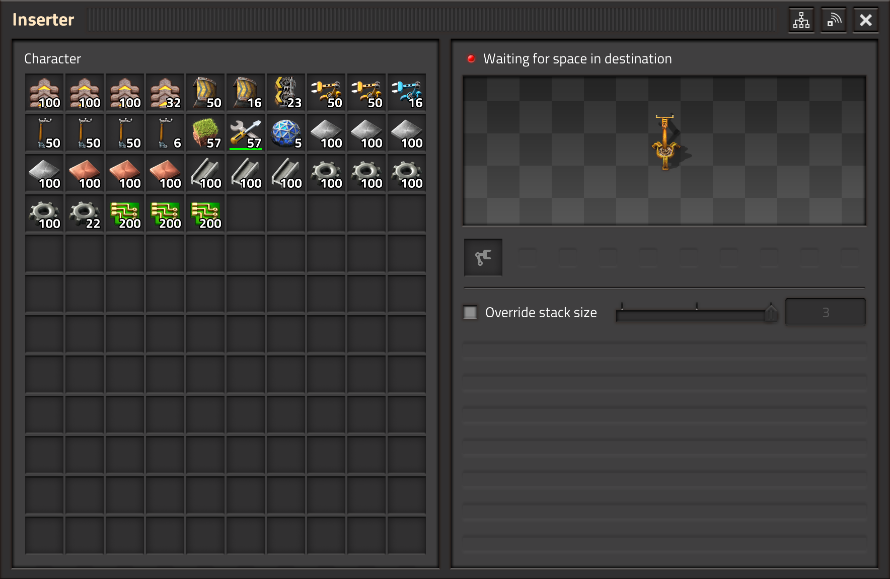
The entity was already showing its status in the tooltip, but it went basically unnoticed by everyone, and the proof is, that there were many different bugs related to the status that no one ever reported. We believe, that the status should help to understand what is going on, mainly, why the entity is stopped at the moment.
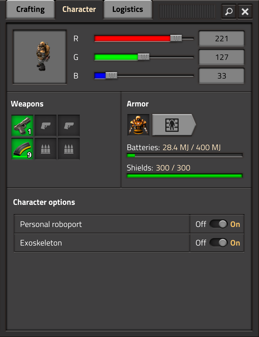
When the tabs were being designed, the character tab looked like a good idea, but when you inspect it properly, it is basically just filler:
I think that when you have the same thing in two different places, it is a problem. The player is required to make a mental link between these two places and realize that these are the same, so de-duplication is a must!
So the character tab was removed.
This left us with just the crafting and logistics tabs, and based on my experience the fact that the crafting has tabs in tabs feels very uncomfortable. Switching the crafting category with the tabs is something that we do very frequently, and having to focus on which kind of tabs need to be pressed just breaks the flow. I always liked the flat GUI model that we had before, but I didn't want to reject the tabs just because it was something different. But now, when I had the unpleasant experience of playing with the tabs, I can fairly discard them as the default option.
Long story short, the flat style of the Character GUI (which was already an option in 1.0) is now the default.
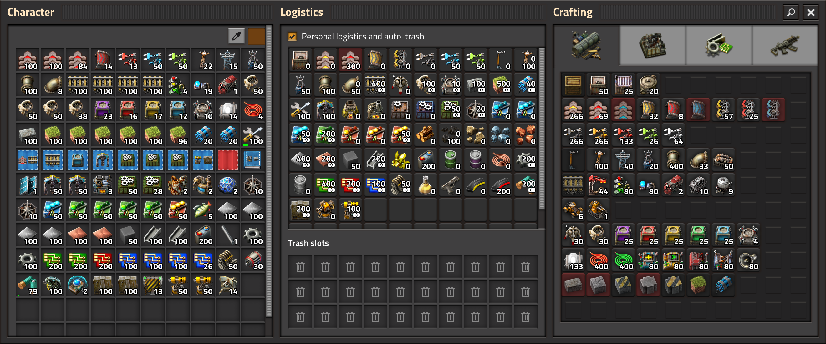
Everything I need at the same time.
When you hover the alert icon, the game shows the alert icons on the related on-screen positions, or if they are off-screen, it shows arrows on the edge of the screen to point you in the right direction.
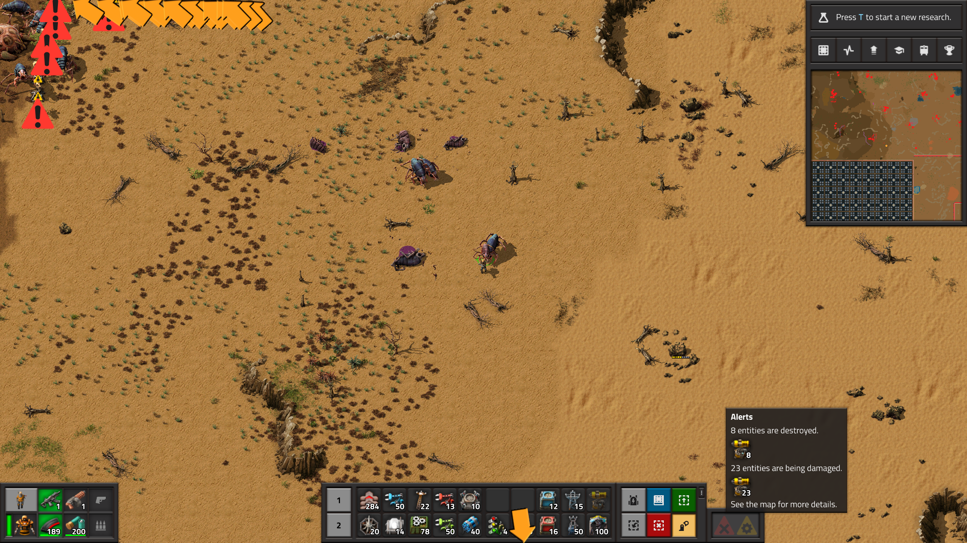
This is an example of a feature, that I just HAD TO DO, because once I realised that the feature could be there, I was almost trying to use it and was annoyed by the fact that it wasn't there. This is actually happening a lot, and makes playing other games much more frustrating to me, as I have no way to add the things I'm missing there. The longer I develop, the more this happens.
We have support for the rich text stuff since 0.17, but we never did the last small piece of work to make it known and usable. I would guess that only small fraction of people actually knew, that they can write things like [item=iron-plate] in the text to put an icon there, as there is actually nothing in the game indicating this would be possible, unless you were reading Friday facts back in 2018 where we talked about it. And even if you know about it, you need to know the internal item names to be able to use it.
So we added this selector:
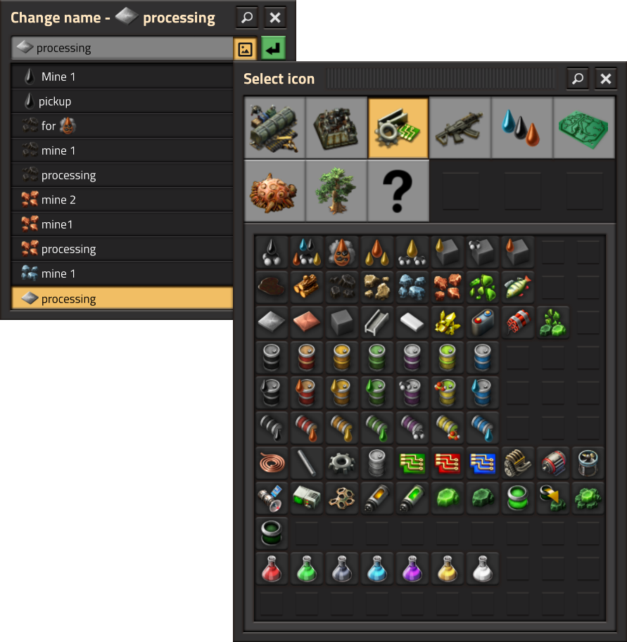
It is present in every relevant textfield including the one in the save game GUI. It doesn't support all the functionality that the rich supports, like changing font color or using some obscure sprites, as we don't want to advertise this usage too much as it can make the GUI look too inconsistent.
This is useful mainly for new players that don't have the position of the recipes burned into their brains, but I can imagine it being also helpful when playing with new/big mod.
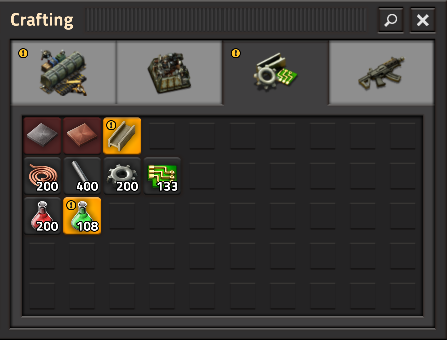
The notifications are cleared by hovering, as expected, and they can be turned off in the options completely.
The main motivation to finally do this was the process of building entities directly from spidertron. It works quite okay, as long as you don't need to build a straight line of belts, in which case it very often happens, that the spidertron fuzzy/erratic movement patterns work against you.
So, from now on, the belt building by dragging will be locked to the direction of the belt. As always, it can be turned off by an option, as it doesn't allow the multi-lane "spraying" building strategy, and some people might find that more important.
We added blueprint building in map for 1.0, which just means, that now we need to be able to also select/deconstruct/upgrade things from the map.
The graphics in the game have had steady improvements over the course of development, with greater detail, better processes, and of course deeper experience. However one part of the game that never quite felt right, was the way entities were lit up at night. We only really had the capability in our engine to draw some basic light sprites over the top of all the entities. This means that the effect was more like a spotlight shining down, rather than an entity emitting the light.
However with some recent technological additions from posila, we have been able to set individual animations and specific sprite sheets of an entity to be drawn as a light source. What this means, is that instead of a entities emitting light only as a circle around them, we can make their night-time lighting much more precise and beautiful.
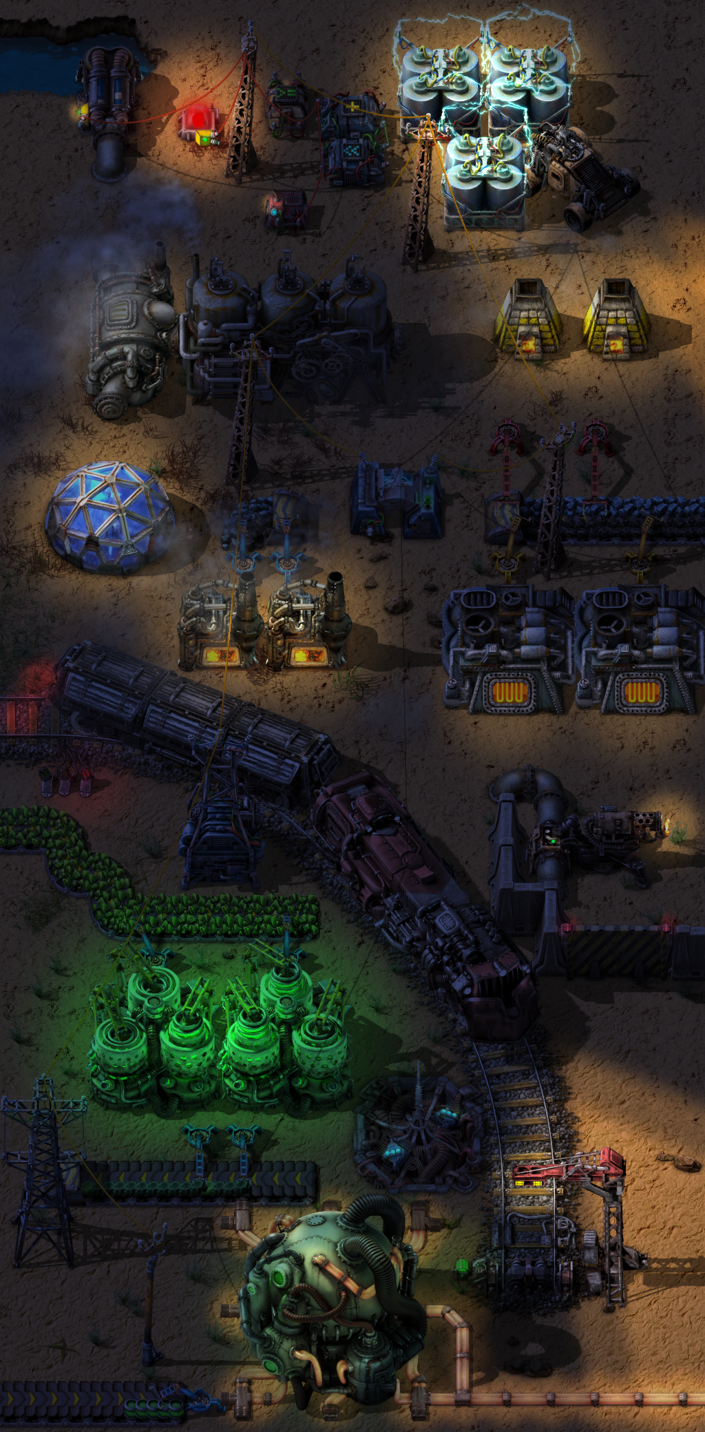
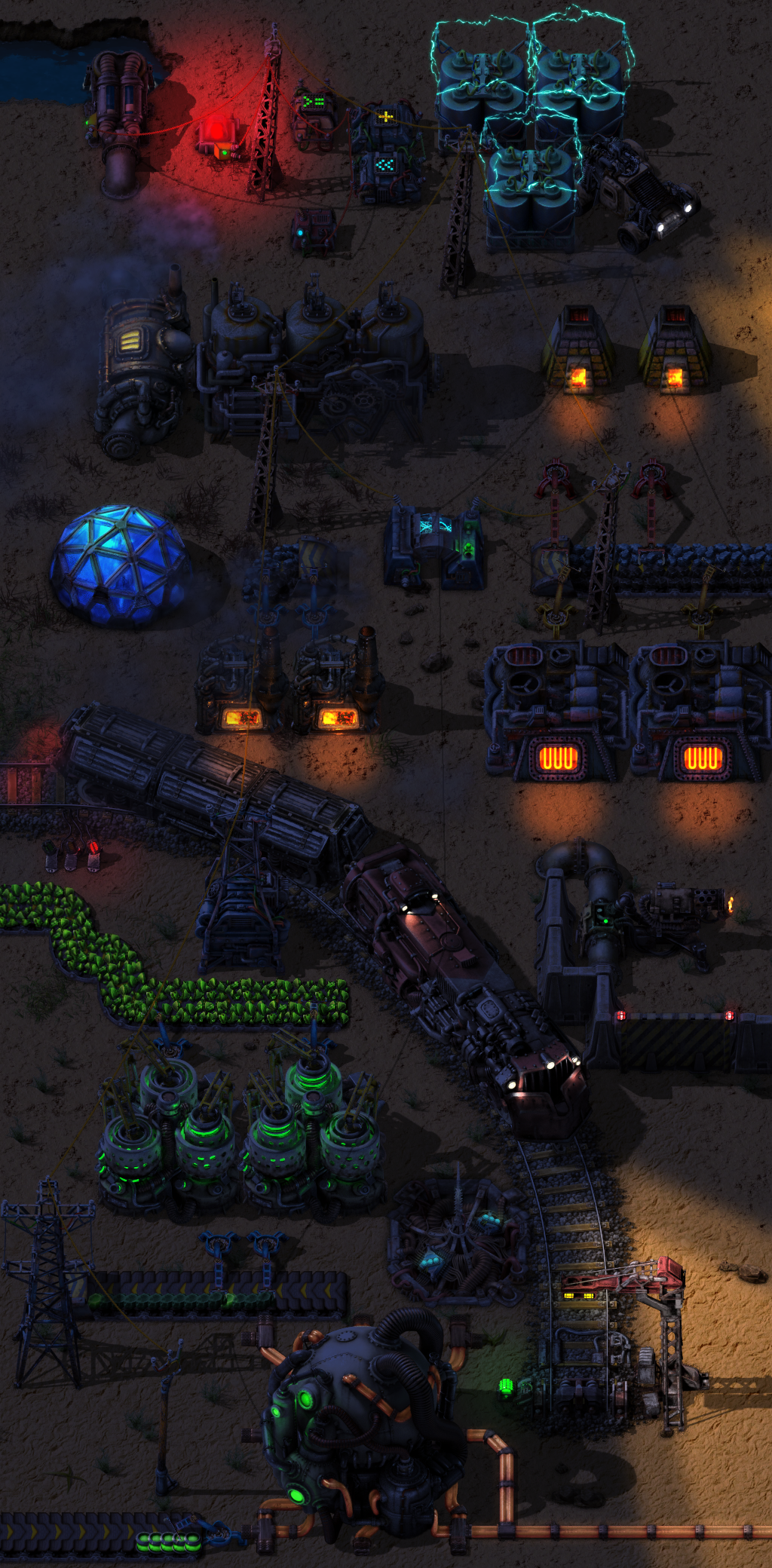
Thankfully we already had quite a lot of 'light masks' rendered out for entities already, such as the centrifuge green glow, so it didn't require anything other than Lua changes to make it work. Some of the entities needed new light masks, such as the Car and Locomotive, which Ernestas was able to render out of the original models without too much trouble.
I think now you will almost be wishing that the night lasts longer, just so you can enjoy the warm cozy glow of your furnaces for a few minutes more.
For a very long time Factorio has had technologies which give the player abstract bonuses, like bonus damage. The problem is, all of them are shown as a red plus symbol, and there is no way to tell which one is which, other than hovering them and reading their tooltip.
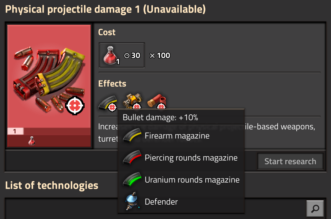
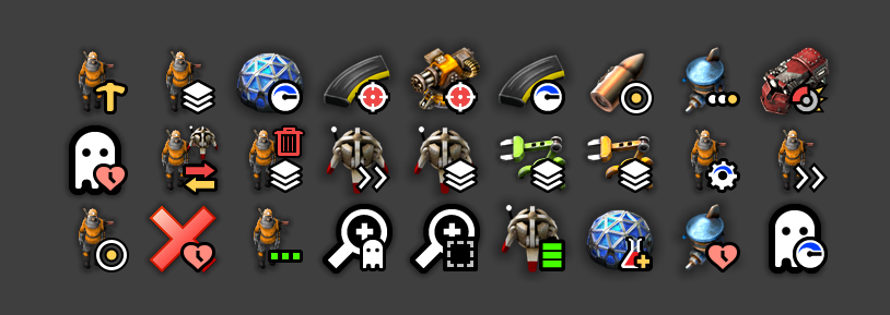
To make it clear what a technology does, we've created a set of icons we call "constants" representing the type of the effect, and they get combined with the icons of the items that they influence.

For researches like damage bonuses, the item icon is automatically inherited from the most basic item. This means if a mod adds an ammo category with its own ammo, the effect icons on a technology influencing this modded ammo, will show its icon correctly.
As you can see below, the constants can also draw on the technology icon itself. Better yet, when you hover the effect, it not only tells you the name of the effect and the amount of improvements it provides, but also a full list of all items/entities it affects.
There is a finite number of effects that can be enabled by mods, and we have added some visual representation to every one of them. Some are more ridiculous than others, but some are also very rarely used even by the wildest mods.
We were planning to revisit all technology icons for a while now, but we always only had time to fix the most obvious problems. As a result, the technology icons were worked on in batches over time and a lot of them look inconsistent or obsolete.
The technology effect icons and their constants demand some technology icons to change as some of the iconography they use is no longer fitting, so we will take the opportunity to revisit all of the technology icons.
The first versions of 1.1.x will only have a few icons updated, but even the old ones will be given colour adjustments similar to what happened to the game sprites in 0.18.0 (FFF-320), and mipmaps (which will break mods). During 1.1 stabilization, we will only be updating the images/sprites which won't break anything.
Speaking of breaking things...
With the march of progress and ongoing development, there comes some point in time where we have to cut support for older save games. 1.1 seems a good time to do that once again, so we are dropping support for save games from 0.16 and 0.17. If you want to preserve those save games, you will need to load them in 1.0 (which can load 0.16 and 0.17 save games) and resave them.
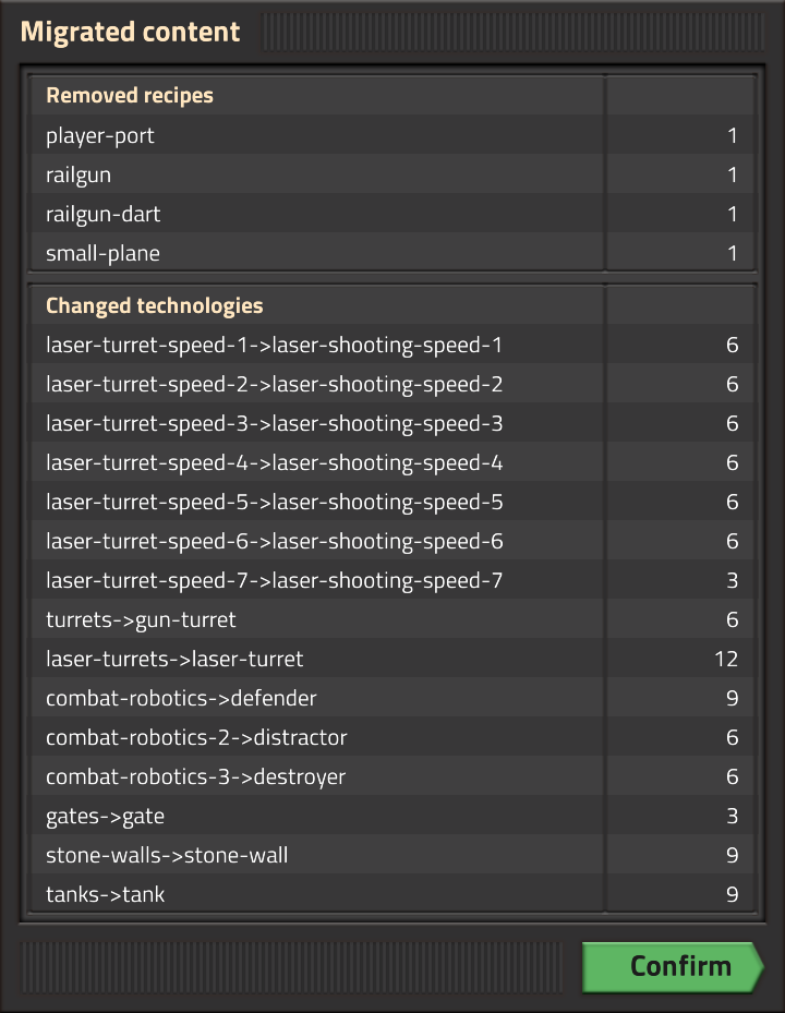
We are also taking the opportunity to remove some old clutter from the code base, things like the old campaign 'Plane' and 'Computer' items, unused old wreckage entities, and so on. This will likely not impact a typical player, but will break some scenarios and mods that were using these things.
When we were looking at the new technology icons, we also realised some have inconsistent names. For instance we have 'Combat Robotics 1/2/3', but each only unlocks a single item. So in this case we have renamed them to 'Defender', 'Distractor' and 'Destroyer', and the icon will reflect the more specific naming of the research.
We also did some minor grammatical tweaks, such as unifying all the technology names to be singular.
Furthermore, there are a lot of small changes to the game data and Lua API that can cause mods to break. If you are interested/concerned, Bilka has compiled a list of changes on the forum.
All these small tweaks and renames have the possibility to break some mods that were referencing them, it is just the nature of the way the game works. We hope though, that 1.1 will be otherwise smooth for modders, as we don't plan to introduce much content during the experimental period.
We look forward to hearing your thoughts, and as always, you can share them with us at the usual places.