At the time of writing the Friday Facts last week, not all of the planned changes were finished, here is the finalisation, so here we go.
The problem is old. You play a modded game and have your blueprints in the library. Then, you decide to put the mods aside for a reason (to join a MP game, or just try a different modset). At that moment, if we didn't handle it in a special way, all your mod-related content in your blueprint library would be removed.
We solved the main part of the problem already quite some time ago. But with the upcoming support of other tools in the blueprint library it had to be extended.
Special system was created for these things:If the related ID isn't available any more while loading a game. Instead of just plainly removing it, it is marked as unknown and the original textual representation of the ID is stored in a special way.
The tool can still be normally used. Clearing the "unknowns" removes the information about the slot for good, but if you don't clear them it stays there.
![]()
![]()

Once you load the appropriate mods again, the IDs are restored.

The UX of upgrading blueprints/books with the upgrade planner was meant to be provisional, but somehow, it remained in use for quite some time.
Currently, the only way to use it is to click the button with an upgrade planner in your cursor, which is sometimes quite annoying, as you don't even have access to your inventory or Blueprint library when you want to click the button, so you have to close the window, find the upgrade planner you want to use, open the window with the upgrade planner already in cursor, and then use it.
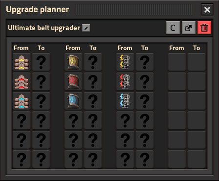
So this window was created. When you click the upgrade window, the game searches all the upgrade planners available to you (inventory and blueprint library) and lets you select which one to apply, and always offering the default upgrade planner.

As you probably noticed from the picture, I couldn't restrain myself from adding a little feature. Upgrade planners can be now used both ways: as upgrade with left click and downgrade with right click. It obviously works also when upgrading in the world.
The problem is, that you can already do 3 different kind of things with the tool, and there are generally quite a lot of people that don't know about basic things you can do, like cancelling a deconstruction orders or force-building a blueprint. Because of that, we added instructions to every tool so the users won't miss it.

This is a great example of a feature, that I expected to be done quickly and easily... but you know how it goes.
The first problem is related to build and drag. Most of the blueprints don't work that well when you just build and drag them.
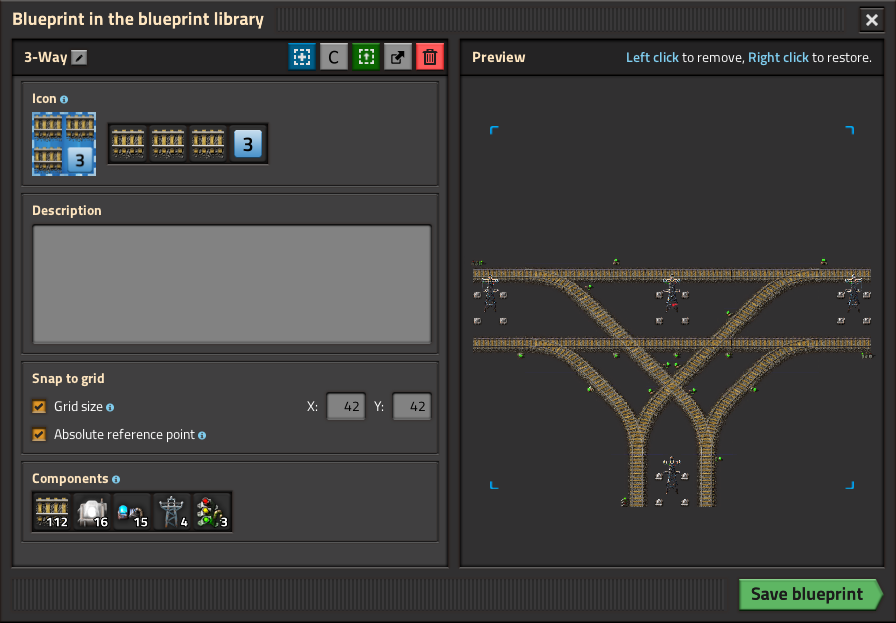
The second problem is that blueprints are often designed to work in a grid, but there is no way to enforce it. Either you have to build slowly and cautiously, or you misclick often. And with the new feature of building in map, the problem was just elevated. This is what the second checkbox is for, it forces the blueprint to be built in a grid aligned to the map center. To ensure, that the user can configure individual blueprints in a way that they would match perfectly, the relative position of the blueprint to the grid can be configured by moving the red flag.

Thanks to Boskid, our beloved tester, a big pile of bugs had been already identified and fixed, so there is a chance of the BP library being released next week.
Since more than a year ago Dominik has been updating and improving all kinds of visual effects in the game - particles, splashes, explosions and so on. During most of the time we’ve also been getting valid questions - "But what about the nuke?".

It was the plan from the start that the explosion of the atomic bomb would come last. Not because it’s the lowest priority, quite the opposite - however it’s also by far the most challenging effect to create, both on the technical and graphical side, so we kept improving how particles/explosions work, and experimenting with graphics for effects - essentially practicing and preparing ground for the nuke.
The most major challenge visually is the sheer size of the explosion. Normal explosions already benefited greatly from more flexible and various scorch marks and particles, and improving the explosion sprites themselves, but that’s not enough here.
The atomic bomb has such a giant explosion radius that we simply cannot (mostly because of VRAM requirements) create an explosion sprite that would cover all of it.
We’ve tried to make an explosion as large as we could fit in a reasonable spritesheet, and limit its frame count as much as we could as well. Just like we did in the old days when VRAM was much more of a concern.
This mushroom cloud does not cover nearly enough though, so for sure some part of the effect needs to be procedural.
The VRAM is not the only problem though, the biggest challenge for the visuals is yet again the perspective of square tiles, where visually the game looks like the player is viewing it at 45° angle, but everything is presented as if viewed top down. Both of these things are intentional and graphics get the shorter end of the stick when it comes to compensating for this dichotomy (FFF-133).
After discussing many really different approaches we could take, we decided to create a combination of a central spritesheet, with a shockwave of smokes being moved outward from the center.
We tried to make graphics hide this perspective problem as always, and made the explosion move slower vertically, resulting in a visually correct ellipse.
As you can see in the animation above, this exposes the problem of entities dying in the vertical direction before the waves get to them.
So we made the damage apply slower in the vertical direction as well. This does mean you can minmax and run away vertically when shooting the atomic bomb under your feet and you will have a better chance of survival, but that shouldn’t be too much of an issue
We’ve also added a secondary damage radius, so it’s more forgiving if you’re just barely getting hit while running away.
For further improvement, we’ve added a ton of random elements to how the particles move and when they disappear which again makes the edge of the explosion less obvious, but also helps diminish the crescent-like shapes at the end.
The explosion is so large that even creating a scorch mark of an appropriate size for it is a problem, so Ernestas created a scorch mark as big as we could afford, and added a whole new tileset to the ground zero, with decoratives to smooth the edges out a bit.

The atomic explosion also destroys everything in a small radius at the center (killed entities don’t spawn corpses, decoratives are destroyed and cliffs disappear), which makes the explosion feel a lot more powerful and impactful. The nuclear tiles remain there forever and are visible from the map view as they have their own map colour, though you can place concrete over them to hide the evidence of your actions.
To complete the effect, we’ve added a brief overbright of the whole screen based on how far the player’s screen is from the explosion, and added sound effects which also react to distance from the explosion.
You will be able to enjoy becoming death, the destroyers of worlds, in the new fashion on 14th August, in 1.0.