This week was the time to close and finish all the things that will go to 0.17.0.
Not all of the things that we originally planned to be done were done (surprise), but we just left any non-essential stuff for later so we won't postpone the release any further. The plan is, that next week will be dedicated to the office playtesting and bugfixing. Many would argue, that we could just release instantly and let the players find the bugs for us, but we want to fix the most obvious problems in-house to avoid too many duplicate bug reports and chaos after the release. Also, some potential bugs, like save corruptions, are much more easily worked on in-house.
If the playtesting goes well, we will let you know next Friday, and if it is the case, we will aim to release the week starting 25th February.
Since there are a lot of things we would like to do before we can call 0.17 good enough, we will simply push new things into the 0.17 releases as time goes on. Even if 0.17 becomes stable in a reasonable time, we would still push things on top of it. We can still make experimental/stable version numbers inside 0.17. Most of the things shouldn't be big enough to make the game generally unstable. I've heard countless times a proposal to make small frequent releases of what have we added, this will probably be reality after 0.17 for some time.
The smaller releases will contain mainly:
This is actually quite a large change to our procedures, and there are many ways we will be trying to maximize the effectiveness of smaller and more regular content updates.
There are several GUI screens that are finished. Others (most of them) are just left there as they are in 0.16. They are a combination of the new GUI styles and old ones. They sometimes look funny and out of place, but they should be functional.
| General UX | UX draft | UX review | UI mockup | UI review | Implementation draft | Implementation review | Final review | |
| Load map |  |
 |
 |
 |
 |
 |
 |
 |
| Save map |  |
 |
 |
 |
 |
 |
 |
 |
| Graphics settings |  |
 |
 |
 |
 |
 |
 |
 |
| Control settings |  |
 |
 |
 |
 |
 |
 |
 |
| Sound settings |  |
 |
 |
 |
 |
 |
 |
 |
| Interface settings |  |
 |
 |
 |
 |
 |
 |
 |
| Other settings |  |
 |
 |
 |
 |
 |
 |
 |
| Map generator |  |
 |
 |
 |
 |
 |
 |
 |
| Quick bar Twinsen |  |
 |
 |
 |
 |
 |
 |
 |
| Train GUI kovarex |  |
 |
 |
 |
 |
 |
 |
 |
| Technology GUI Oxyd |  |
 |
 |
 |
 |
 |
 |
 |
| Technology tooltip Oxyd |  |
 |
 |
 |
 |
 |
 |
 |
| Blueprint library kovarex |  |
 |
 |
 |
 |
 |
 |
 |
| Shortcut bar Oxyd |  |
 |
 |
 |
 |
 |
 |
 |
| Character screen Dominik |  |
 |
 |
 |
 |
 |
 |
 |
| Help overlay kovarex |  |
 |
 |
 |
 |
 |
 |
 |
| Manage/Install mods Rseding |  |
 |
 |
 |
 |
 |
 |
 |
| Recipe/item/Entity tooltip Twinsen |  |
 |
 |
 |
 |
 |
 |
 |
| Chat icon selector ? |  |
 |
 |
 |
 |
 |
 |
 |
| New game ? |  |
 |
 |
 |
 |
 |
 |
 |
| Menu structure ? |  |
 |
 |
 |
 |
 |
 |
 |
| Main screen chat ? |  |
 |
 |
 |
 |
 |
 |
 |
| Recipe explorer ? |  |
 |
 |
 |
 |
 |
 |
 |
The blueprint library changes have been split into several steps. The reason is, that there was a big motivation to do the integration with the new quickbar (final version introduced in FFF-278) in time for 0.17.0, while the other changes can be done after. The thing with the quickbar is, that it is quite a big change to one of the most used tools in the game and people generally don't like change even when it is for the better. To minimize the hate of the change, we need to "sell it properly". By that, we should provide as many of the positive aspects of the new quickbar at the time of its introduction.
So the change that is already implemented and working for 0.17 is the ability to put blueprints/books into the quick bar in a way that the quick bar is linked directly to the blueprint library window, so you don't need to have the physical blueprint items in your inventory. The other change is, that picking a blueprint from the blueprint library and then pressing Q will just dismiss it, instead of silently pushing it to your inventory. This works the same as the clipboard described in FFF-255. You can still explicitly insert the blueprint from the library to an inventory slot, but if you just pick it, use it, and press Q, it goes away.
In addition to this, other changes related to the blueprint library will follow soon after 0.17.0. The first thing is the change of how the GUI looks:
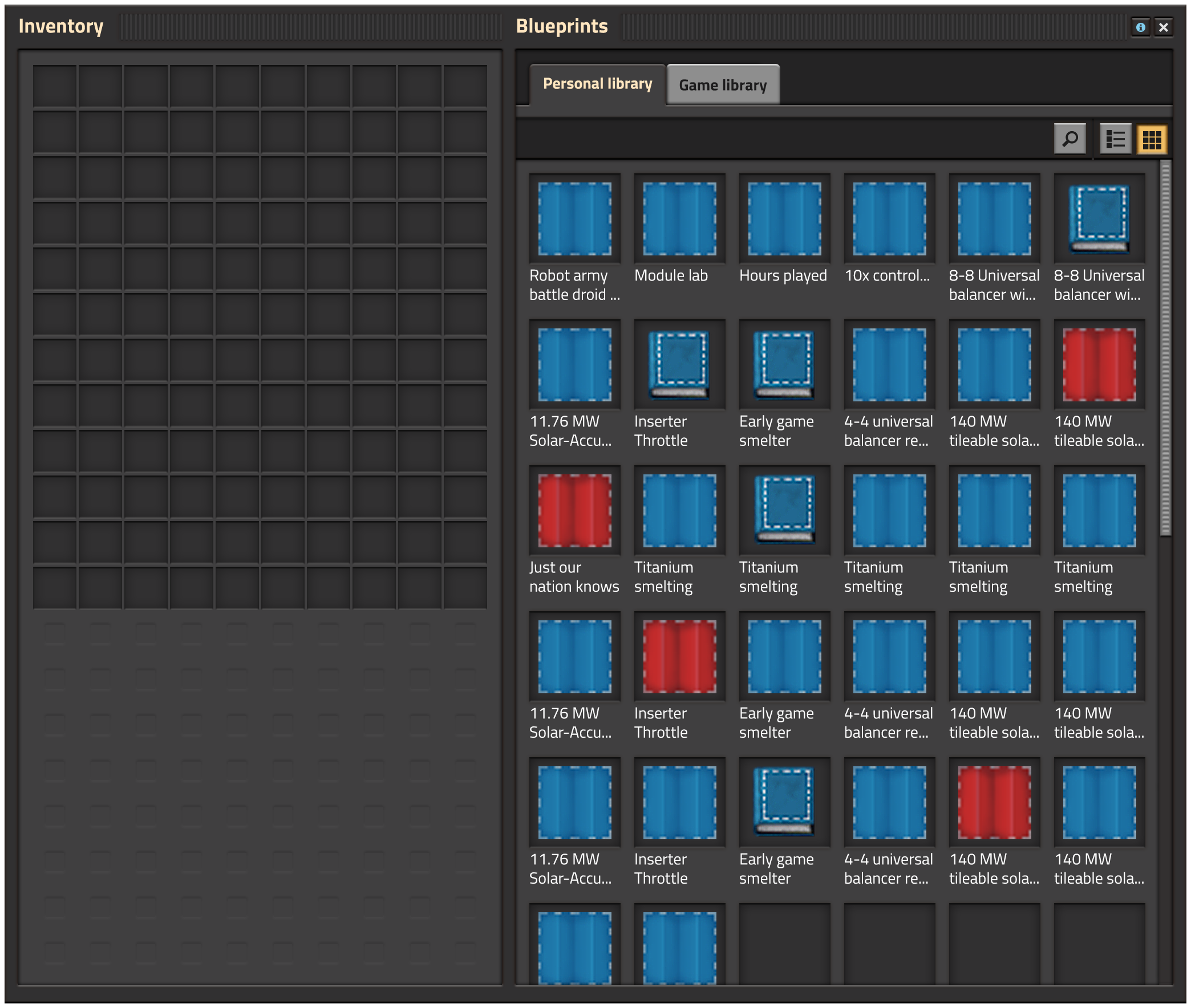
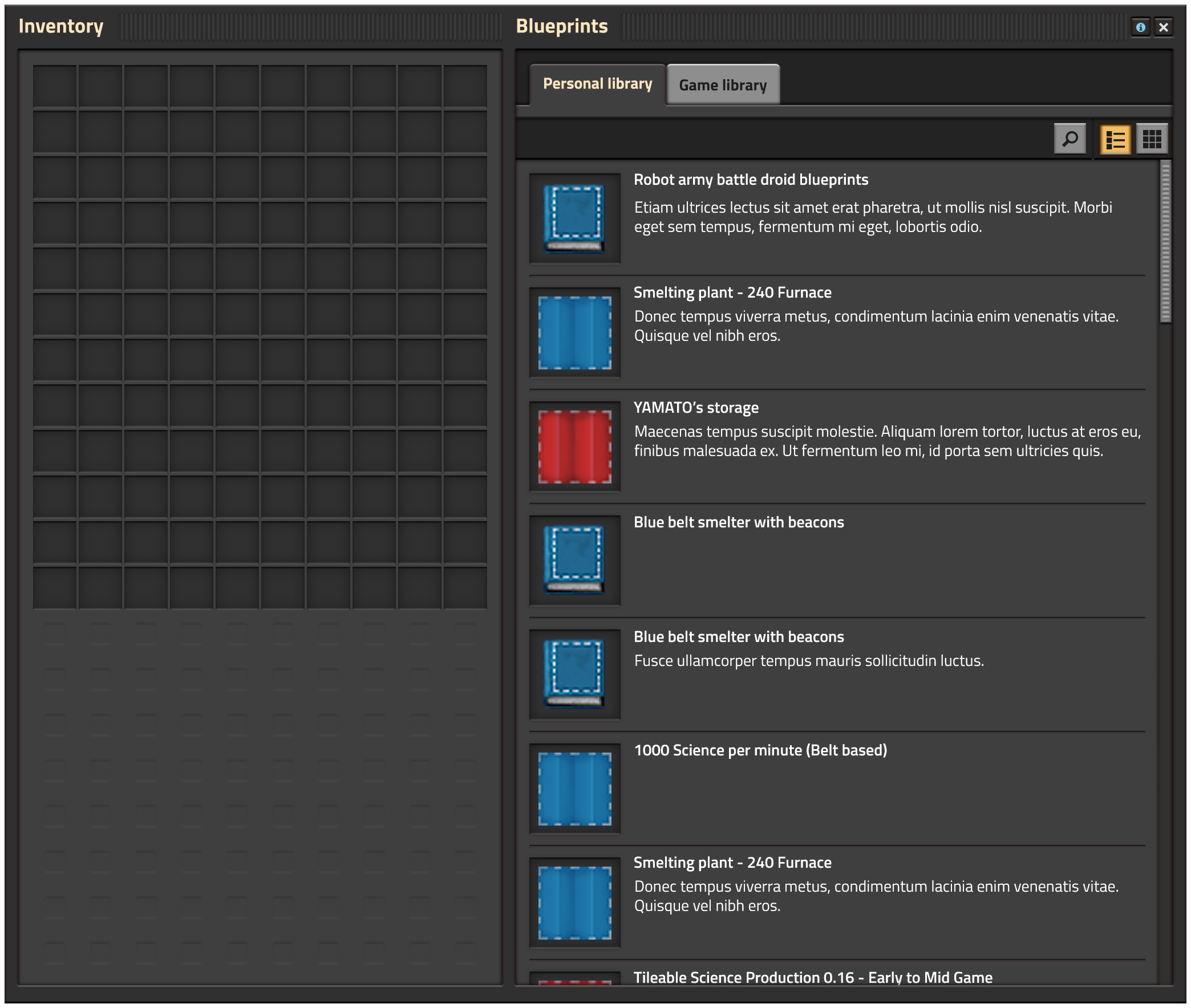
We will also allow to switch between grid and list view. It mainly provides a way to nicely see the longer names of the blueprint. We noticed that players try to put a large amount of info about a blueprint in its name, so we are planning to add a possibility to write a textual description of the blueprint.
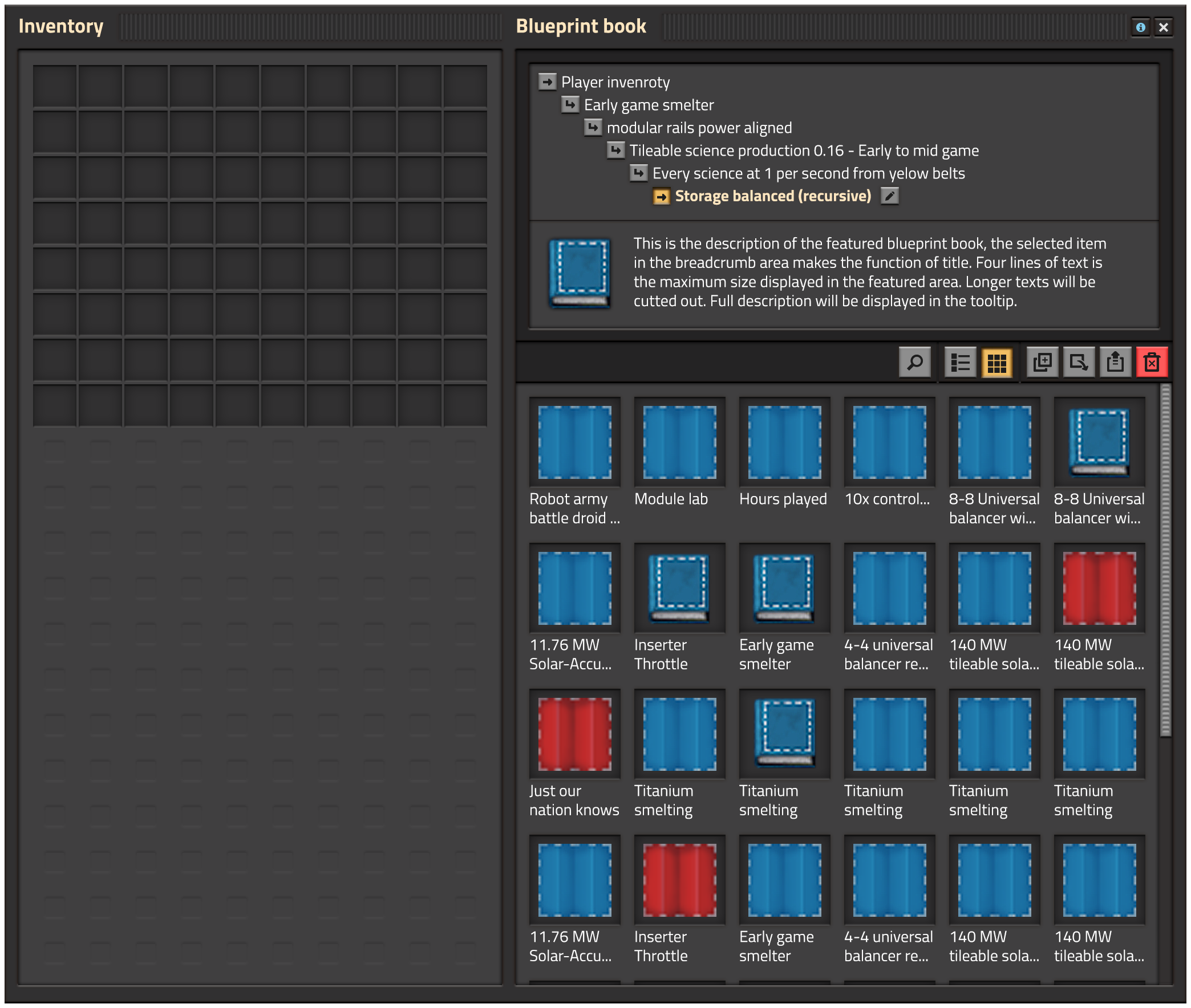
The last big change is to allow to put blueprint books into blueprint books, allowing better organisation. Basically like a directory structure. Whenever a blueprint/book is opened, we plan to show its current location, so the player knows exactly what is going on.
Has it ever happened to you, that you have robots trying to put things into your full inventory, while you pick an item from it to build something, and then you just can't put it back, as the diligent robots just filled the last slot in your inventory by whatever they are trying to give to you? Wood from tree removal is the most frequent thing in my case.
This was annoying in 0.16 from time to time, but with the new quickbar, it started to happen even more, as now, you have only one inventory, and no reserved slots in the quickbar. To solve that, we just extended the "principal" of the hand. When you pick something from the inventory, the hand icon appears on the slot. As long as you hold the thing in your cursor, the hand stays there, and prevents other things from being inserted there. This way, you should always be able to return the currently selected item into your inventory as long as you didn't get it from external source like a chest.
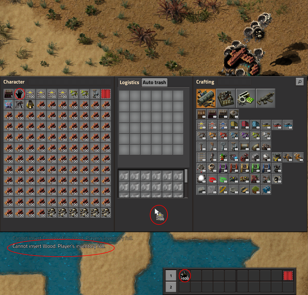
The hand is protecting the slot from the robots.
Everyone has different opinions about what makes a good Factorio world. I've been working on several changes for 0.17, but the overarching theme has been to make the map generator options screen more intuitive and more powerful.
This was talked about somewhat in an earlier FFF (FFF-258) regarding ore placement, but since then we found more stuff to fix.
In 0.16, the size control for biter bases didn't have much effect. The frequency control changed the frequency, but that also decreased the size of bases, which wasn't generally what people wanted.
For 0.17 we've reworked biter placement using a system similar to that with which we got resource placement under control. The size and frequency controls now act more like most people would expect, with frequency increasing the number of bases, and size changing the size of each base.
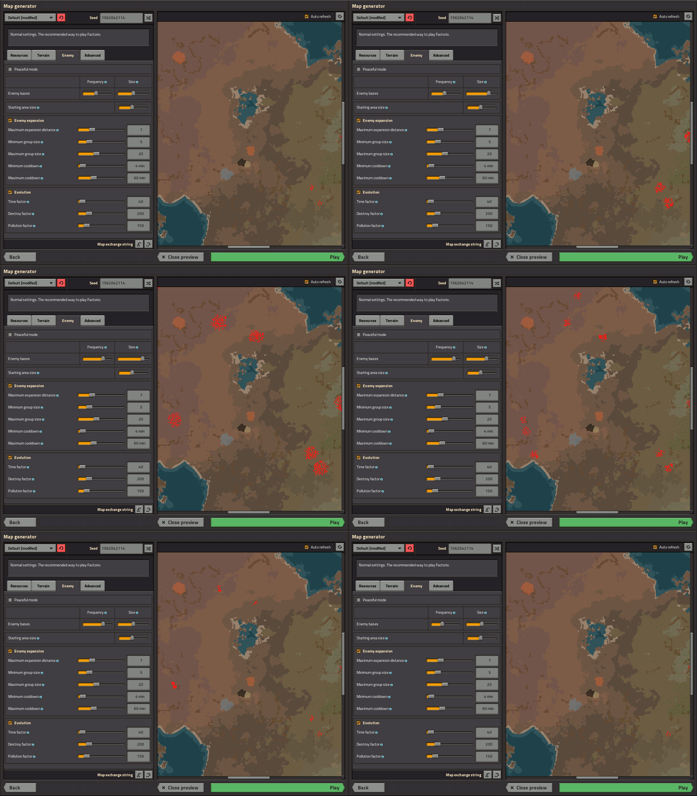 New preview UI showing the effects of enemy base controls.
In reality the preview takes a couple seconds to regenerate after every change,
but the regeneration part is skipped in this animation to clearly show the effects of the controls.
If you don't like the relatively uniform-across-the-world placement of biters, there are changes under the hood to make it easier for modders to do something different. Placement is now based on NamedNoiseExpressions "enemy-base-frequency" and "enemy-base-radius", which in turn reference "enemy-base-intensity". By overriding any of those, a modder could easily create a map where biters are found only at high elevations, or only near water, or correlate enemy placement with that of resources, or any other thing that can be expressed as a function of location.
We've added a 'continuity' control for cliffs. If you really like mazes of cliffs, set it to high to reduce the number of gaps in cliff faces. Or you can turn it way down to make cliffs very rare or be completely absent.
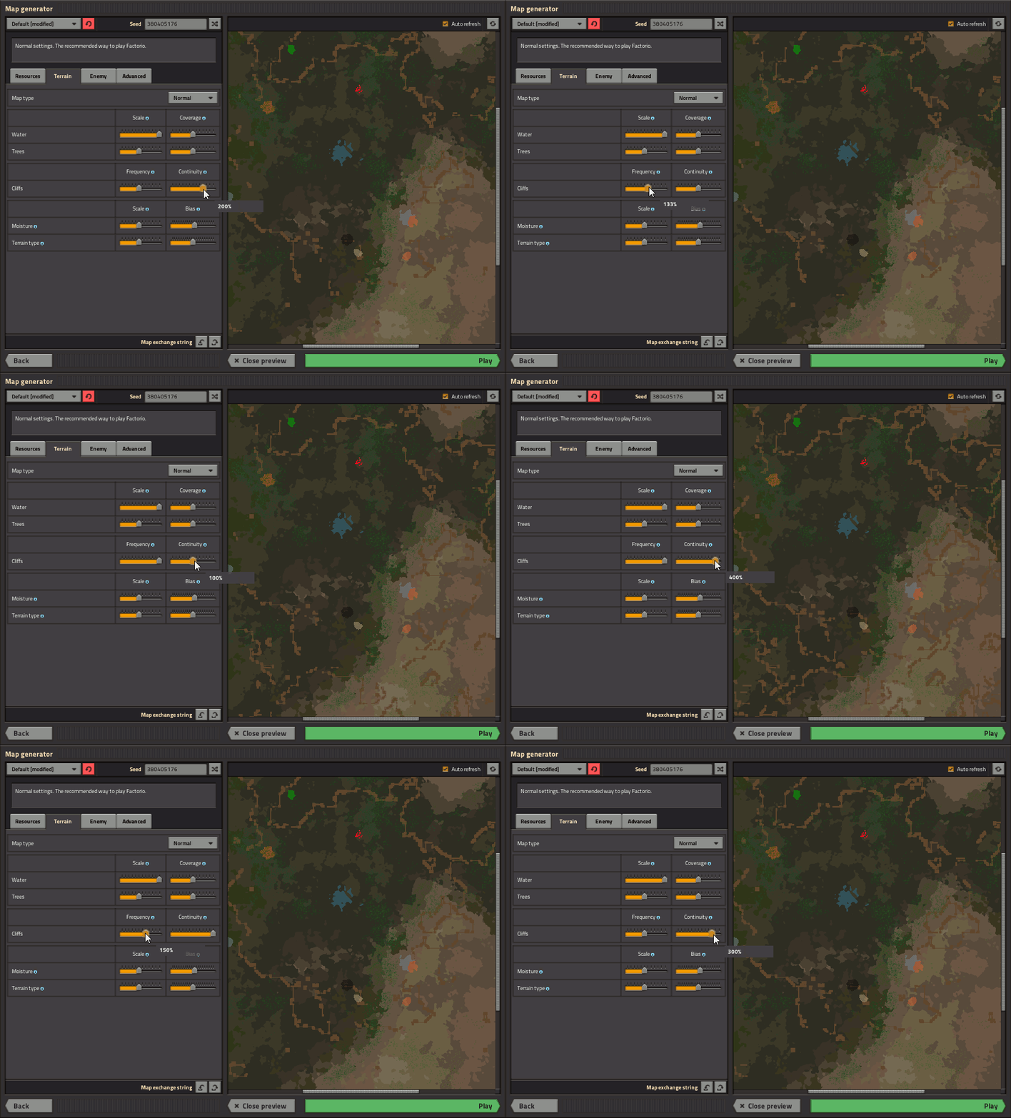 Changing cliff frequency and continuity. Since cliffs are based on elevation,
you'll have to turn frequency way up if you want lots of layers
even near the starting lake.
Tile placement is based on a range of humidity and 'aux' values (humidity and aux being properties that vary at different points across the world) that are suitable for each type of tile. For example: grass is only placed in places with relatively high humidity, and desert (not to be confused with plain old sand) only gets placed where aux is high. We've taken to calling these constraints 'rectangles', because when you plot each tile's home turf on a chart of humidity and aux, they are shown as rectangles.
It's hard to make sense of the rectangles just by looking at the autoplace code for each tile, so I wrote a script to chart them. This allowed us to ensure that they were arranged as we wanted, with no gaps between them, and with overlap in some cases.
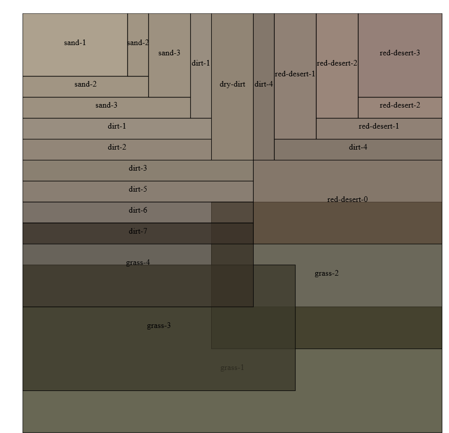
Rectangles.
Having the humidity-aux-tile chart is all well and good, but doesn't tell the whole story, since tile placement also depends on a noise layer specific to each tile type, and could also influenced by user-adjustable autoplace controls (e.g. turning the grass slider up). So to further help us visualize how humidity, aux, tile-specific noise, and autoplace controls worked together to determine tiles on the map, there are a couple of alternate humidity and aux generators that simply vary them linearly from north-south and west-east, respectively.
 Using 'debug-moisture' and 'debug-aux' generators to drive moisture and aux, respectively.
This map helped us realize that, rather than having controls for each different type of tile, it made more sense to just control moisture and aux (which is called 'terrain type' in the GUI, because 'aux' doesn't mean anything).
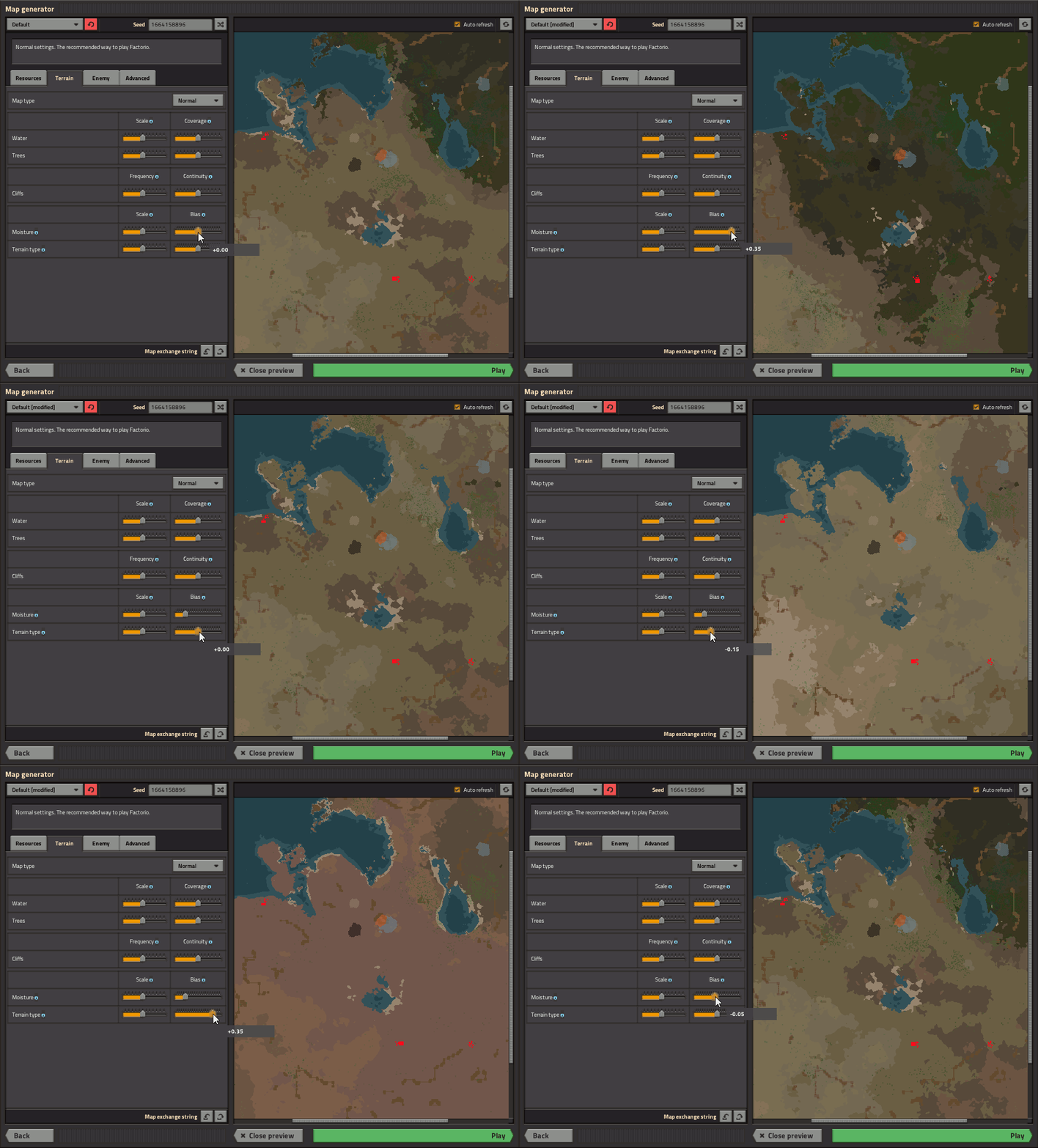 Sliding the moisture and aux bias sliders to make the world more or less grassy or red-deserty.
A pet project of mine has been to put controls in the map generator GUI so that we could select generators for various tile properties (temperature, aux, humidity, elevation, etc) at map-creation time without necessarily needing to involve mods. This was useful for debugging the biome rectangles, but my ulterior motive was to, at least in cases where there are multiple options, show the generator information to players. A couple of reasons for this:
For 0.16 I attempted to make the shape of continents more interesting. Some people really liked the new terrain, or at least managed to find some settings that made it work for them. Others called it a "swampy mess". A common refrain was that the world was more fun to explore in the 0.12 days.
So in 0.17 we're restoring the default elevation generator to one very similar to that used by 0.12. Which means large, sometimes-connected lakes.
The water 'frequency' control was confusing to a lot of people including myself. It could be interpreted as "how much water", when the actual effect was to inversely scale both bodies of water and continents, such that higher water frequency actually meant smaller bodies of water. So for 0.17, the water 'frequency' and 'size' sliders are being replaced with 'scale' and 'coverage', which do the same thing, but in a hopefully more obvious way. Larger scale means larger land features, while more coverage means more of the map covered in water.
In order to ensure a decent starting area, the elevation generator always makes a plateau there (so you'll never spawn in the middle of the ocean), and a lake (so you can get a power plant running). Depending on what's going on outside of that plateau, this sometimes resulted in a circular ring of cliffs around the starting point, which looked very artificial, and we wanted to reduce that effect.
In the process of solving that problem I created another custom generator for debugging purposes. This one simply generated that starting area plateau in an endless ocean. I don't actually remember how this was useful for debugging, but at one point I directed Twinsen to look at it to illustrate the mechanics behind generating the starting area.
The rest of the team liked that setting so much that we're making it a player-selectable option. So in 0.17 you'll get to pick between the 'Normal' map type, which resembles that from 0.12, and 'Island', which gives you a single large-ish island at the starting point. There's a slider to let you change the size of the island(s).
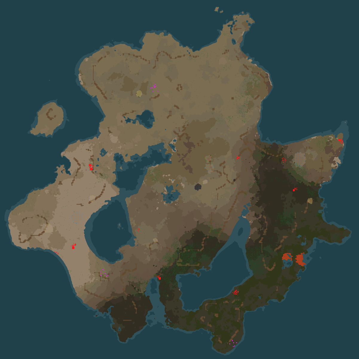
Maps with multiple starting points will have multiple islands.
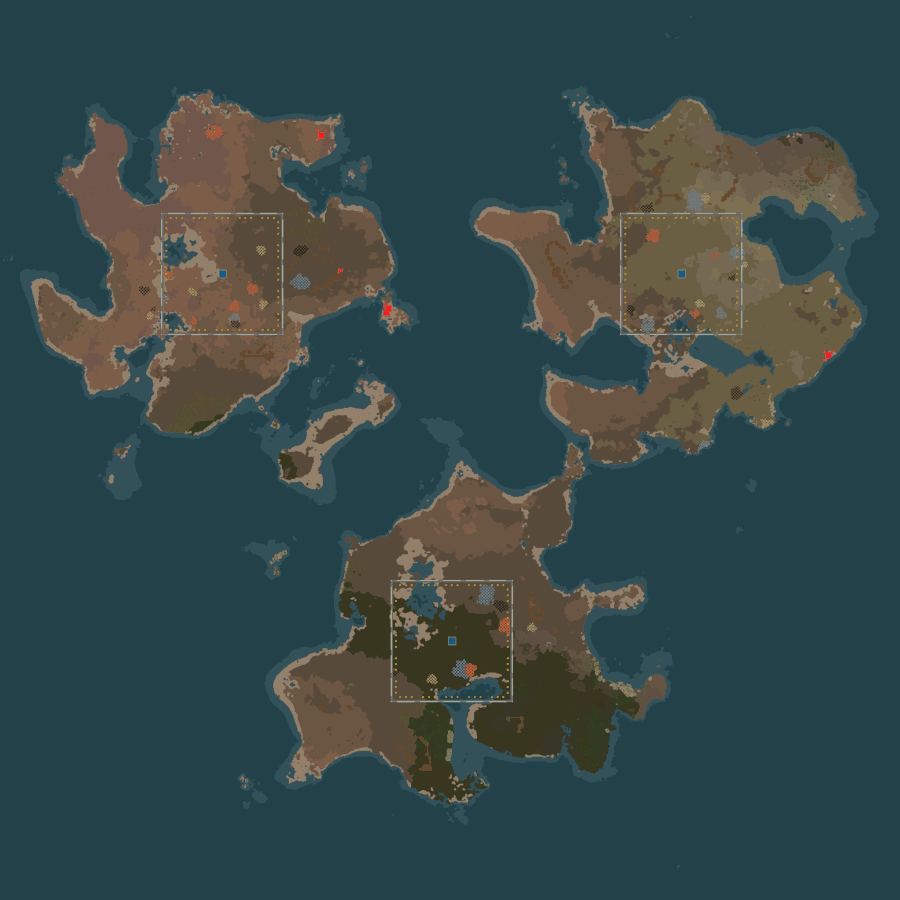 PvP islands!
And speaking of scale sliders, we're expanding their range from ± a factor of 2 (the old 'very low' to 'very high' settings) to ± a factor of 6 (shown as '17%' to '600%'). Previously the values were stored internally as one of 5 discrete options, but as the recent terrain generation changes have made actual numeric multipliers more meaningful in most contexts (e.g. the number of ore patches is directly proportional to the value of the 'frequency' slider, rather than being just vaguely related to it somehow), we're switching to storing them as numbers. This has the side-effect that if you don't mind editing some JSON, you'll be able to create maps with values outside the range provided by the GUI sliders.
Mods will be able to add their own 'map types' to the map type drop-down, too. If you really liked the shape of landmasses in 0.16 and want to be able to continue creating new maps with it, please let us know on the forum.
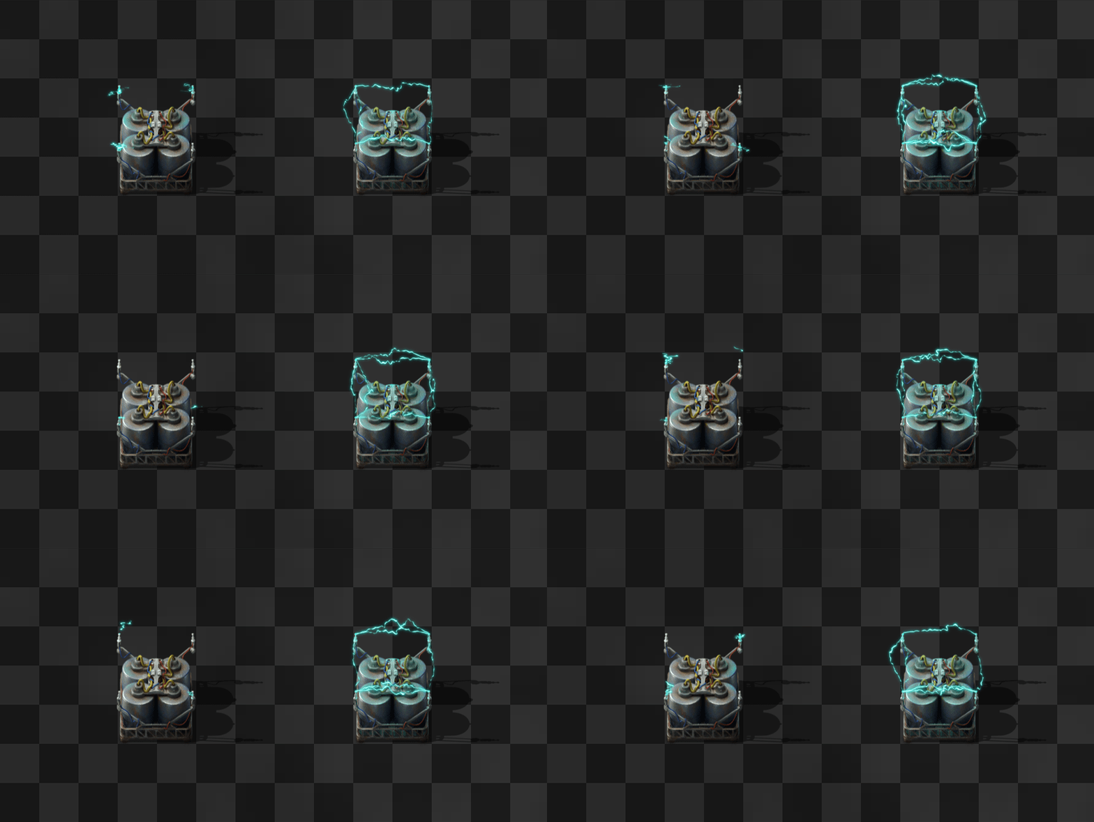
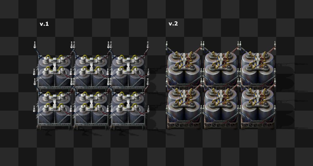
The design of the accumulator has been always good. The 4 very visible cylinders, looking like giant batteries, Tesla poles and the electric beams perfectly telegraphed its function in terms of style and readability. That’s why for the high-res conversion we were very careful about keeping this entity as it was.
The only thing that was a bit disturbing (for some) are the poles crossing to each other when more than one accumulator is placed in a row. So we decided to fix it (or break it). The rest of the work was making the entity compatible for the actual look of the game. But in essence accumulators are still the same.
As always, let us know what you think on our forum.