As you are probably already aware, some of our team members are going to attend PAX East in Boston next week.
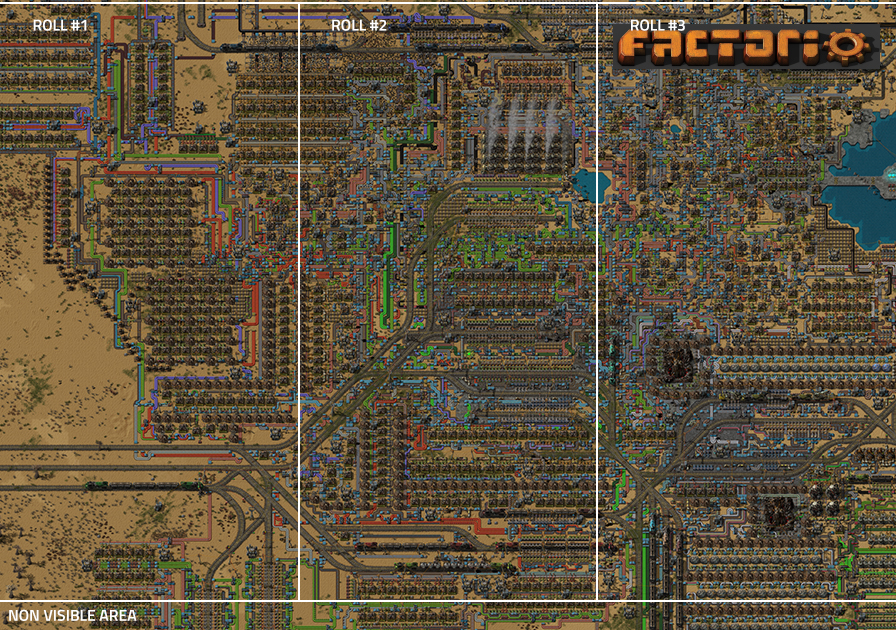
We figured we need some representative prints for our booth, but what to put there? We could have just made a big mega high resolution render of the player character or some other entity, but that would not tell the viewer much about what the game is about. So we thought it would be much better to "just" take a giant screenshot of a working factory, print it, and done! Now of course it’s much more complicated than that…
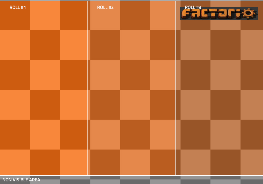
The first obvious hurdle is that you need a savegame to take this screenshot of. So you go and try to take a bunch of random saves on your disk, you open them and find that it’s not so easy to just find a factory which would look nice. Such a factory needs to show enough of the various things to represent the game, can fit the logo somewhere, and must be large enough to fill about 275x185 tiles (3x2 meters at 150dpi taken at game zoom 2)... one square in the following picture is a chunk (32x32 tiles)

Luckily I just had a savegame which was easy to adapt to those requirements, but I would like to ask the question, how does one build such a factory in general? That’s what I have been trying to figure out for a long time now. As some of you may have already noticed, I enjoy constructing very organic factories, a part of which eventually turns into a crazy mess. A mess as crazy as Factorio itself, representing what your will brain look like after playing Factorio.

I find this to be a good opportunity to be a bit more specific and see a few examples to put it into more context...
It’s the year 2015 and pretty much every factory I had built so far eventually arrived to the problem that in order to expand it, I would have to severely modify or destroy large portions of it. I hate to just throw away all the work that I did on my belt knots, so the outcome would usually be that I just stop playing that map and start over.
Once I made a factory that was my largest so far. It used Bobs productivity modules level 7 with a stupid amount of productivity bonus, possible to put into any recipe, and without decreasing the speed of the machine.
This alone may sound ridiculous but what it did was allow me to focus on just having fun adding more and more things to the factory, while caring about throughput much less, especially in situations where I could just add better modules to existing factories, leaving more ingredients for other things, allowing me to build even more production lines.
Of course sooner or later the furnace area would just not be enough and expanding it on the spot would be a pain, so I just started a new dedicated factory just for smelting like many factories do. Trains brought the necessary things and later on I added another factory for circuits and the factory kept being happy. Eventually I dropped under 40 UPS and didn’t want to continue any more. It’s worth mentioning that there was no space science or infinite research back then, so there was little incentive to continue.
DiscoveriesIn the second half of 2016, I started a new factory. Learning from the past discoveries, I wanted to embrace the concept of replacing production lines for intermediates with train stations which would import these items.
Producing those intermediates however required a large rail system outside of the main belt cluster. This gave the factory a lot more expandability and I had spent more time on this map (160 hrs) than any before by a large margin. Like all nice things, the amount of effort directly influences how nice is the result going to be, as with the outer train network expanding, the main base also continued to grow.
DiscoveriesIn the following several months I would try to start a few new maps with different factories and different concepts, but each time something just wasn’t going in the right direction and eventually I would recognize that it’s not "The One" and lose interest in it.
I was starting to feel like it was only a matter of luck, and I only made the SpaceScienceBase look awesome by accident as I couldn’t deliberately achieve the same again. I kept thinking about what it is that makes it stand out, what are the differences from the other two, for example:
I believe a part of the problem was how I focused on efficiency by preparing for whole rows of beacons for everything (especially the vertical ones), or how I separated the oil and rail related entities from the core of the main factory. Everything just ended up being straight and boring.
So eventually I started a new map with all of those things in mind. I made a rough plan for myself what I would like it to end up, and then tried to follow it. The rail system would be extremely expandable but use both single and dual headed trains for variety, the main factory would automate literally every single recipe in the game, and I would try to keep things as organic as possible. I could have tried harder to put more pipe and nuclear related entities in the middle of the factory... perhaps next time I guess.
Here you can see it grow:
When I was building, I saved over 300 iterative versions of the map. The timelapse is then created by taking a screenshot in each of those saves, and in post-production they are blended together so that it looks smoother.
I found out that we need a screenshot of these dimensions just shortly before the logo appears on the map. You can see not much had to change, except all the terrain under the whole screenshot area was manually reworked in the map editor. This gave me a bunch of ideas of what we need to do to make the map editor better - both for our use with scenarios and campaign, and for our players.
If you are interested in reading more about how the base works or downloading the savegame, you can proceed to the imgur album.
The final result is a trio of rollups totalling 3 meters in width and 2 meters in height. This whole thing has been quite an experience for me. Building a factory and doing my own fiddling is great, but building a factory, sitting down with Albert (our art director), thinking how to improve the general visual composition of it, making it fit the requirements etc. was just outright amazing. Just the part where I needed to put the logo and remove a bunch of train stations, cut many belts and reconnect them, was a very cool challenge. If I started again I would have probably done a few things differently, but something would probably be wrong if I didn’t feel like that. Overall I must say I am quite satisfied with the result.
Imagine a friend of yours is trying to introduce you to this game, shows this screenshot to you and says: "Hey, this is the game I have been repeatedly telling you about lately..." What would be your response?