Hello,
it feels really nice these weeks. We actually have some time to improve the game instead of just fixing bugs. Lets take a look on some of the improvements.
Learning basics of UI design on the fly
We wanted to hire some professional UI designer to solve our problems, but it isn't so easy to get one, so we have to learn how to do it ourselves.
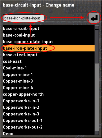
Lot of the things are solvable by just staring at it critically. Lets have an example. This is how the current UI for rename station looks:

So what is wrong about it?

- What is the refresh button? You need to try it out to understand, that it changes the station depending on the selection in the list.
- What is the play button? It changes the name depending on the text in the input box
- So there are two separate ways to confirm that are totally unrelated and the icons are not helping to understand it
- The list height is too small to make the scrolling through lot of stations frustrating.
This is how the window was changed:
- There is just one exit point, which renames the station to the name in the text field.
- Selecting something in the list changes the text in the textfield, where it can be altered or accepted as it is.
- The maximal list height is bigger so it is easier to find the desired station.
Now, lets take a look at the schedule

What is wrong on this one? (Before scrolling down, you can try it yourself)

- What is the refresh button on the top? Wait it isn't refresh, it actually switches between the view of the cargo of the locomotive and the schedule.
- What is the pause button? It switches between automated and manual mode
- Is the train in manual mode or automated? Well the icon shows pause. Does it mean it is paused? Or the button changes it to pause, so it is automated?
- The pause/play button is on the right of the list, together with buttons to remove/go to station buttons. These buttons are tightly related to the list of stations, but the pause/play isn't. It is misleading.
- There is no indication of the train state, what station is it in? Where is it headed to?
The solution of this problem brings us to the next part.
Better train conditions
It is obvious, that we need better tools to control the train behaviour. We decided to solve it by extending waiting conditions of the train. This is the list of the conditions prepared for 0.13:
- Time passed - The only available in 0.12
- Inventory full
- Inventory empty
- In-activity - No items were added or removed for specified amount of seconds.
- Item count - specific condition can be set, like train contains more than 30 iron plates etc.
- Circuit condition - The train stop will be connectable to the circuit network, so the condition can use it.
We also wanted to make it possible to combine these conditions, so it can be something like Wait for 30 seconds or until inventory isn't full.
This is how the window looks now:

- Tabs make the cargo/schedule context switching much more understandable. Yes the graphics of the tabs needs an upgrade, but we are talking mainly abut understandability now.
- The switch between automatic/manual mode was redesigned. It is clear now which is active, and what can you expect from switching it.
- The station list is only shown as popup window when adding new station.
- More understandable icon of removing station.
- The bottom list is now the list of conditions for the current station, these can be added, removed or modified.
- There is indicator of the train goal now, something I was missing a lot.
There are other windows we need to optimise, but it is interesting learning experience.
The better rail building appendix
The better rail building introduced in the last fff is 90% finished. I was asked if all of the different kind of setups will be buildable without the option to build the curved rail manually. Let me show an example of the manual rail building mode (without any robots).
As always, let us know what you think on our forums.