Imagine yourself living in a perfectly balanced natural environment. With total freedom. A place where your ancestors have been the inhabitants for centuries. Evolving, understanding, and being part of this peaceful world and rich ecosystem. Totally integrated. On this land you can get aliment easily, due the lack of serious predators and pollution, and with the friendly company of your fellows, the only thing you have to take care is food, relax, and reproduction.
Imagine that suddenly, something falls down from the sky. Something that starts the extraction of the minerals, and the eradication of your forests. Even further. Imagine that this newcomer, making use of the stolen resources, starts the production of massive machines aimed to automate the robbery and the production of a never ending factory which creates not only pollution in the air and water, desertification on the land, and starvation for your people, but also, creates heavy weapons in order to exterminate you and your entire species.
Wouldn't you be angry? Isn't that newcomer a sick bastard?
From this B-side of the official story, comes some of the grounds and concept for the graphics and aesthetics. - Before, let me introduce myself, I'm Albert, the Art Director of Factorio since the very early days of development, and this is my first public text concerning the idea of visuals and concept related to art in Factorio.
This sick vision of a nonsense evil factory made of metal, is just one side of what is behind the whole graphic design in the game. Grey, dirty and massive machines that transform a natural paradise into an artificial hell of 'progress'.
I understand Factorio as a sort of space opera based on the industrialization started in the 18th century, which defined the whole 20th century and destroyed a big part of the natural environment and changed humanity. The spirit of the game belongs and pushes this idea to fantastic limits.
Don't get me wrong. The whole concept is quite controversial. We're not trying to convert players into any sort of radical life approach. The industrialization has produced nice things for the humanity, like computers and some sort of better life - debatable -. So Factorio is at the same time a monument to the power of human intelligence and creativity. One single man transforms and takes control of a whole planet by himself. This evil world made out of machines is also beautiful.
The strong point of Factorio is the gameplay, so I guess we don't really need all this detailed fancy graphics in order to have a cool experience playing. But what would happen if instead of having the actual resolution, we will have just vectorial geometric shapes and pure RGB colours?. Very interesting, but maybe a bit boring after a while. We decided to keep this level of realism in order to improve the immersion in the world we try to create. And also this solution give us the freedom of using this synthetic vectorial resolution for pure gameplay aspects and GUI solutions.
We are not Steampunk. Nor Dieselpunk, but we take profit of it all. Everything nice and coherent is always welcome. Coming from the Steampunk culture or relatives. But Factorio is trying to have personality by himself. Factorio tries to be Factoriopunk. This means that there are no rules. Based on steam or diesel technology, but also laser, microchips, nuclear power, DIY, clean energy, alien technology, and whatever comes out of the sci-fi universe improvised by the developers and the community.
Factorio is a videogame - obviously - and it tries to look like that, Some people said that it should be a 3D game. I love the idea, But I'm afraid that if Factorio jumps to 3D, it can lose this 32-bit oldschool retro spirit that makes it look quite unique.
All those theories full of concepts sounds good to me, but let's face it. Reality is different than theory. And the progress of development is sometimes like a jam session. The beginning was hard. There was no definition of concepts, it was just some guidelines concerning size. The actual style came out after thousands of trial and error tests. Different and several personal preferences, references from other games and playability requirements.
After long months of work, we defined a style, that should handle the important aspects: playability and aesthetics. But is not yet perfect. Can you imagine a grey factory - red?. Can you imagine a multiplayer game all grey? Playability is not always friend of concept and aesthetics, like for instance all these requirements in dynamic colours, sizes and heights, bounding boxes, etc are giving important boundaries to the final look. So we are still touching here and there and the result is moving to a better shape everyday, slowly, trying to approach an accurate balance in between all the aspects.
I would say that graphically, the game is on an advanced state, but far from finished yet. There's still a lot of things that are not definitive, but conceptually and technically the look starts to look solid. As a proof, I, personally started to enjoy watching some screenshots, maps and gameplays.- Incredible! -
The actuality of Factorio graphics is a new whole area, the end-game. The outer space. And it tries to look like a mature hard Factorio thing. Hope soon we publish decent previews. Personally I prefer to keep the mystery for a while.
Next, when everything will be done. We will make rounds of polishing all the aspects that are not good enough and improvements on the ones that actually are.
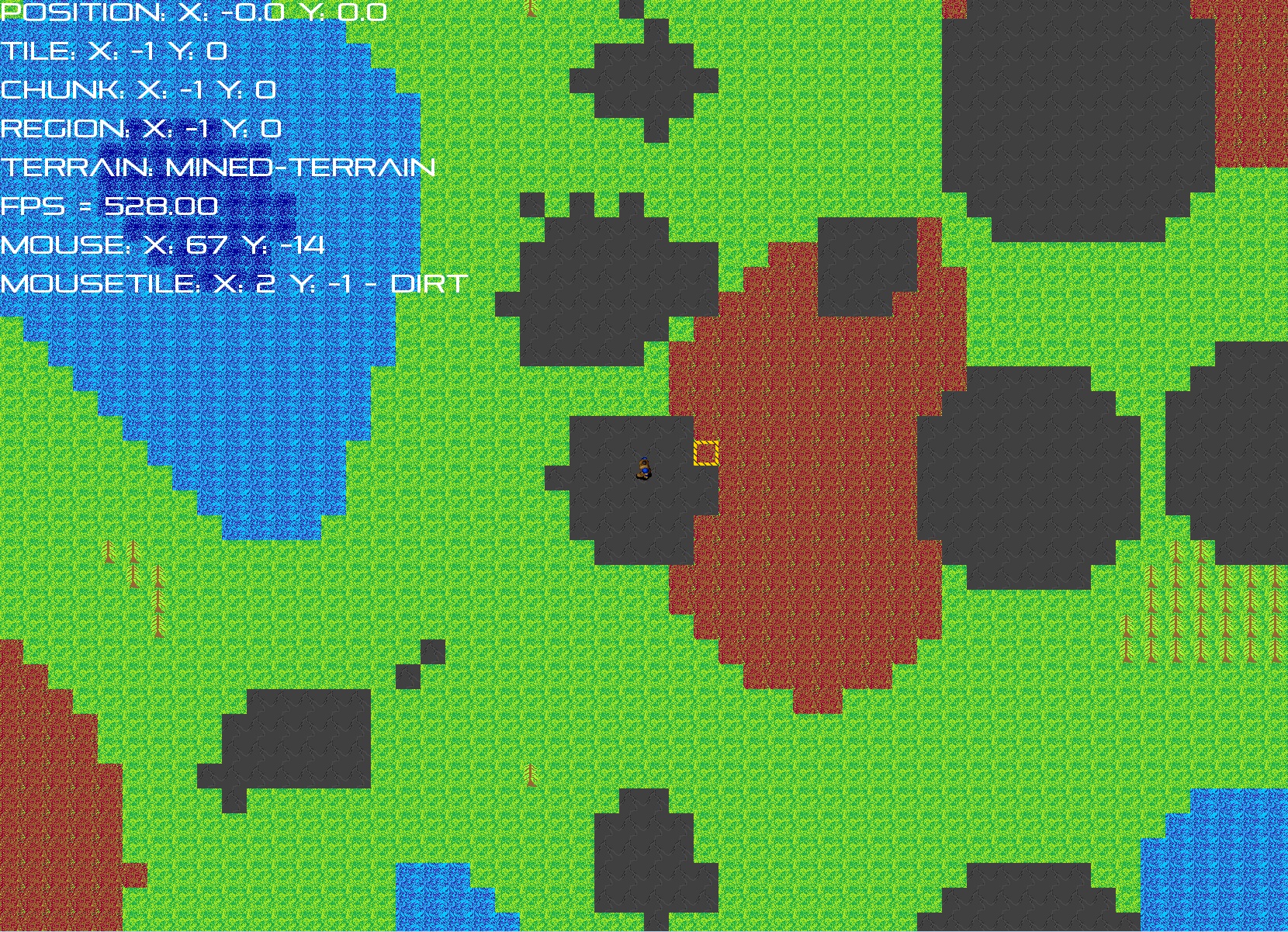
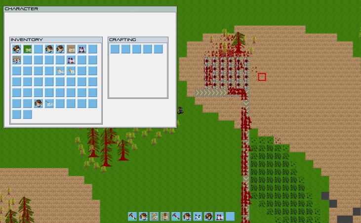
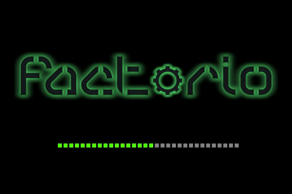
Here some screenshots of historical graphic progress. This screenshots encourage me to keep going and make me confident that if we can have more time we can achieve the perfect game that we have in mind.
This is how the Factorio started (March 2012):
This is the pre-Albert era (December 2012):
Version 0.3. First logo and minimap attempts. (April 2013):
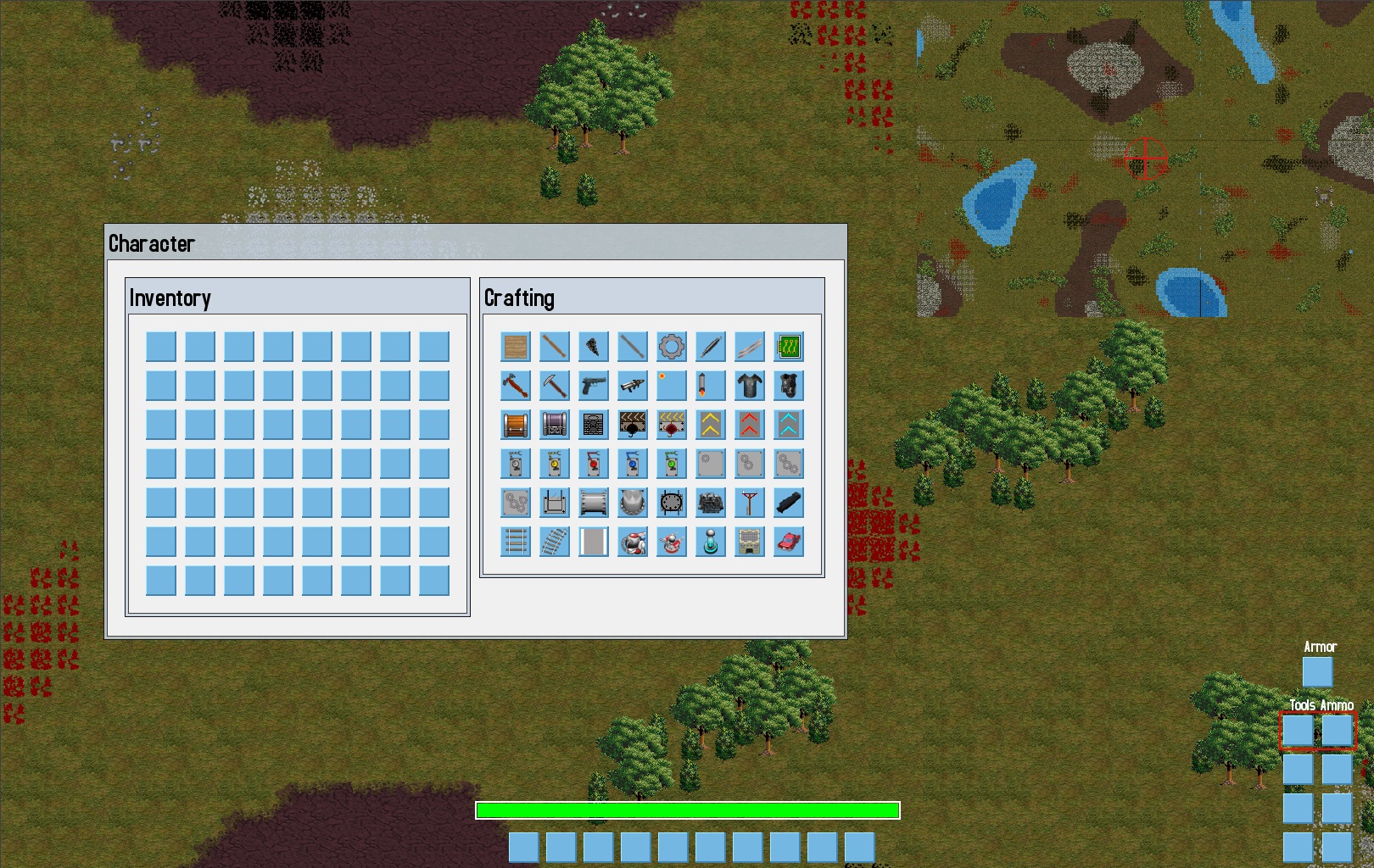
Version 0.7. New GUI and intermediate terrain version. (September 2013):
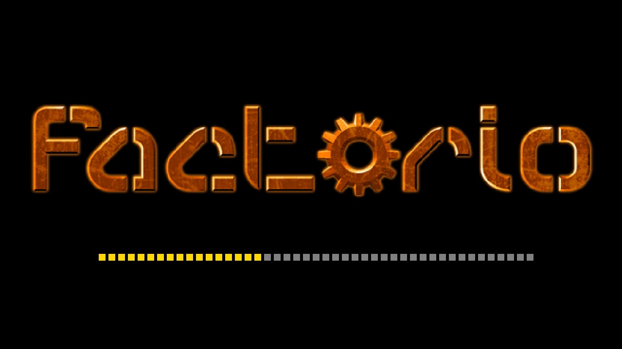
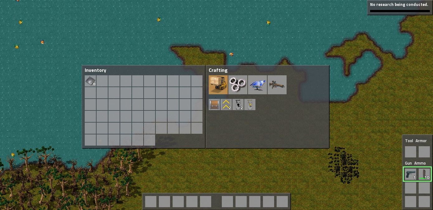
Current version (October 2014):
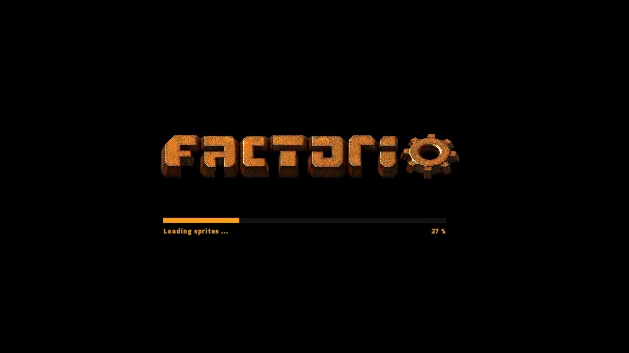
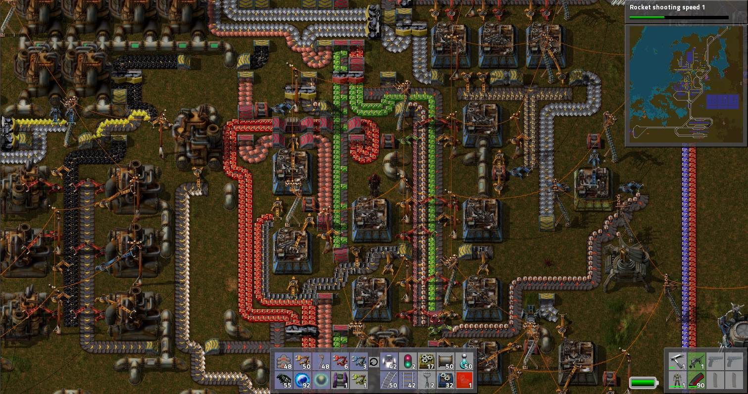
Future version? Who knows :)
I hope the text was interesting for you, we can keep talking in the forums here.