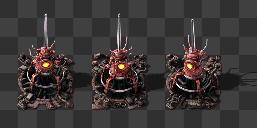
The beacon is one of the last entities left to convert to HR. As always, before 'just re-rendering' we take the chance to re-think the concept and modernize it. This post will try to go a bit deeper in the process of redesigning such an entity.
![]()
At the beginning of the project, the style of the game was less or more clear: nothing looks brand new. Everything looks dirty and DIY. The machines need to be full of details, if possible trying to explain its mechanics. The colors are provided by the raw materials. The bounding box is everything. And some other rules that I don't even remember now.
The main handicap at that time was that we didn't have the experience of how the average player is composing the factories. So we produce a nice looking model but once it is placed in the factory, it doesn't look that nice due to the lack of context.
The beacon is a very advanced late game entity. Usually placed very close to each other in long rows, horizontal or vertical. Its function is to provide extra power to other entities in its surroundings through the air.
One of the main objectives for the redesign is not only a better coverage of the most common needs of the entity (shape recognition, working good in its context, and total integration in the world of the game) but also its expressivity.
It would be really good to understand the use of the machine just by looking at it.

In this early sketch the main concepts are already defined.
It needs to be a tower in order to transmit the effect. But the tower has to be transparent, otherwise it will occlude the other entities behind, creating a problem of readability.
It has to look modern. That's why the conical shape with rounded windows. It reminds of a soviet space capsule. The blinking lights inside will help not only to look more technological, but also will help for visibility.
Due to its normal usage in long rows, the plan was to create an extra tileset of cables connecting the beacons to each other. So the composition would look much more interesting and organic with the player moving under this network of beacons.
The idea is cool and it works on paper, but once we get to work, we realise that it's needed to fill a square of 3x3 tiles. Once in the 3D viewport, this concept changes too much to not think of different solutions.
Connecting the entities with cables. It looks like the beacons are interacting with each other creating a more powerful net of beacons, and this is sending the wrong message.
The main problem was the need of stuffing the tower in a squared area. This rule of the collision box forces every entity to be some sort of a blocky box on top of the ground, always, and for this entity we really needed the tower.

To solve this issue a new concept appears: Let's create a hole in the ground that covers the collision box area, and build the tower inside. It looks higher than what it really is, and the occlusion with the tiles behind is in the acceptable limits.
|
|
|---|
The beacon looks modern, colorful, tall, high tech, and integrated in the world of Factorio. It even solves the collision box issue and is easy to recognize from afar. But it has something wrong: it doesn't work fine in an array, and the center of the entity is too complicated. It creates a chaos of pixels that is hard to see, especially when overlapping with another beacon vertically.
To solve the ultimate complication for the array situation, a few changes are relevant to do.
Cleaning up the center of the entity in a way that works as a background with himself when overlapping in vertical (or any other tall entity, like a pole).

In the so common array situation, it's going to be really nice seeing the beacon with some variations. This will make it look more natural, and pleasant to the eye.
We would like to use this sort of variations for every entity, but the amount of work and VRAM needed would be just insane.
This is still a work in progress. Right now I’m working on the animation of the beams. I’m trying to make it much more subtle, because the way it is here it calls too much attention and saturates the screen very easily.
|
|
|---|
The layer of the beams and the light will be separated and tintable in a single spritesheet. Probably the yellow rounded light also. It will be available for any modder to make a modified beacon just by changing the RGB values.
There are many things I didn't say about this process of redesign, but I had to keep them out because this post is already very long. I hope it was interesting to you. In future releases, very soon, you’ll be able to play with it.